Hitte EP (BE), Concept & Design for the Music Album.
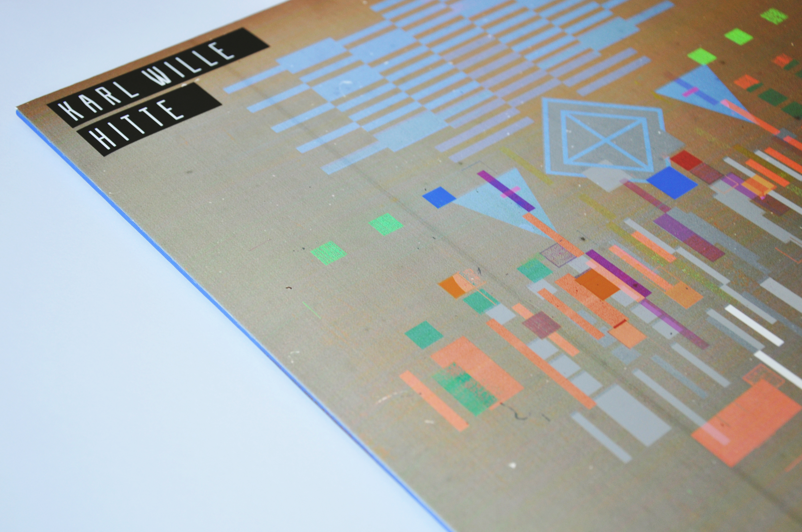
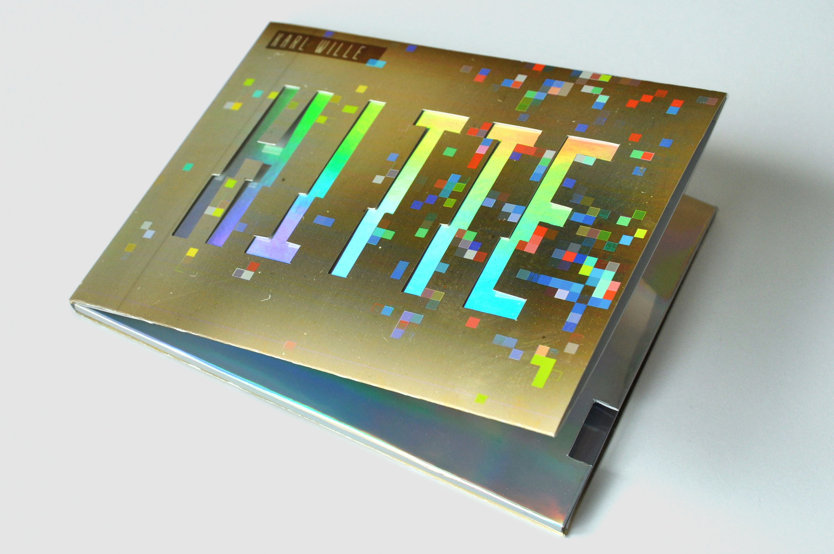
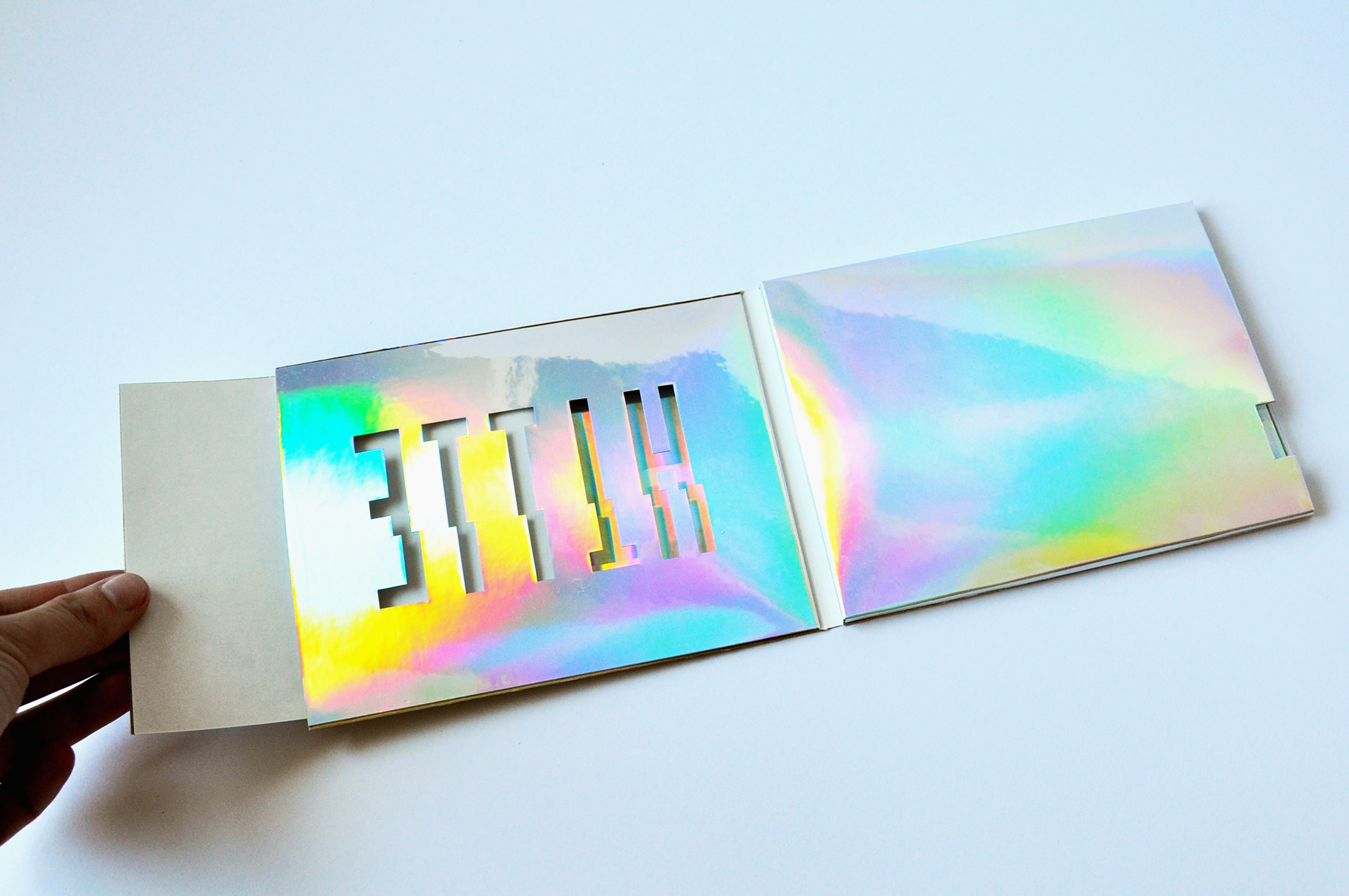
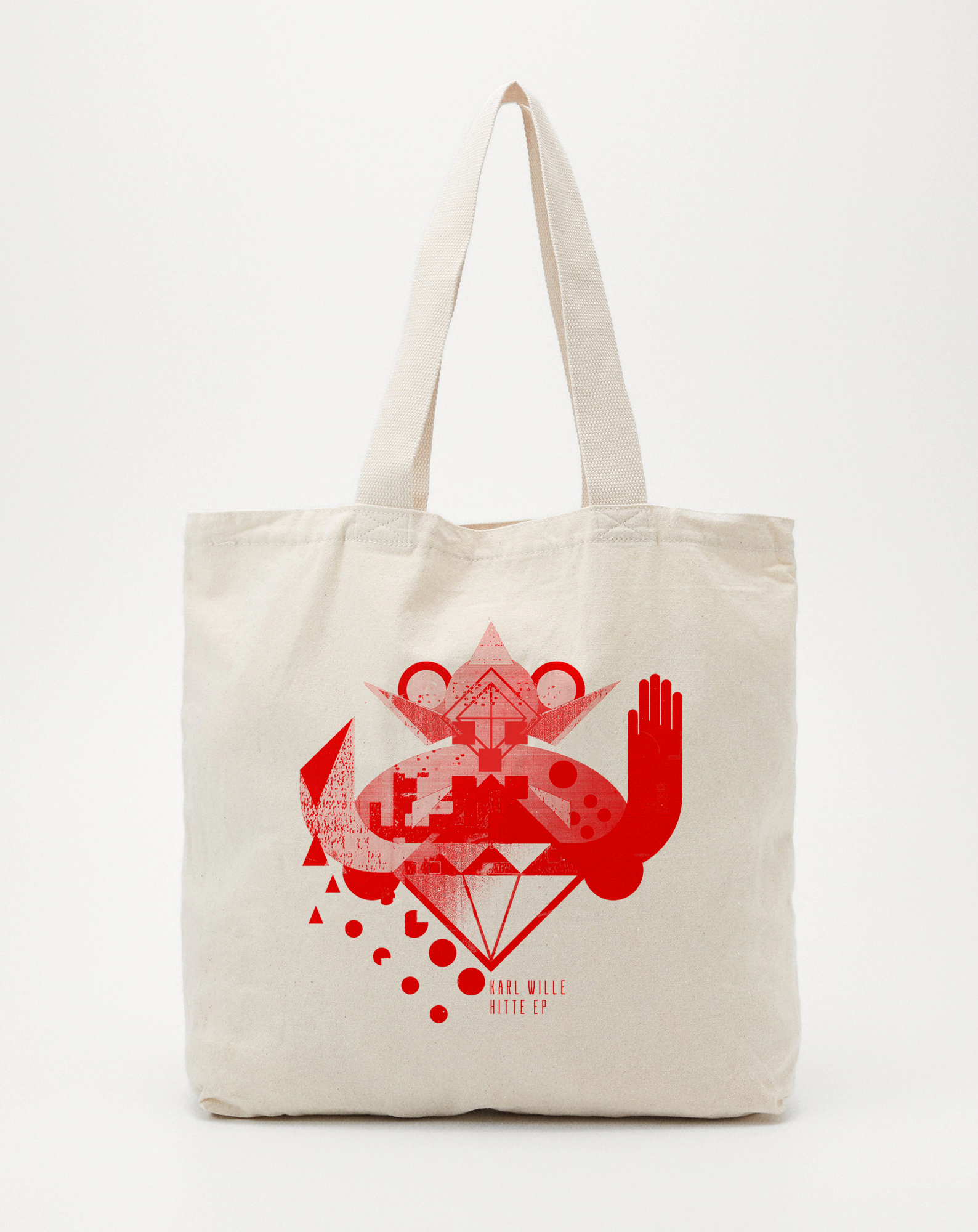
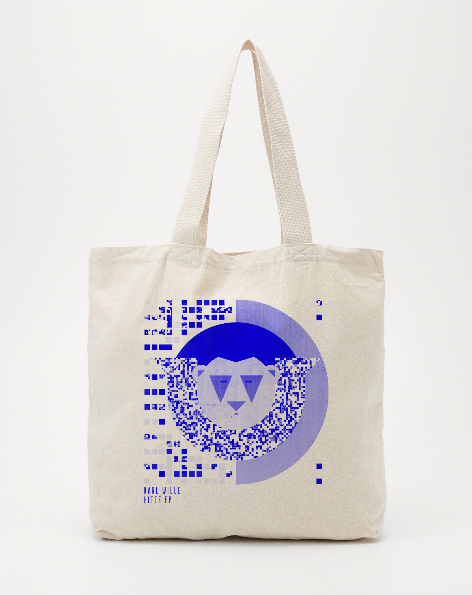
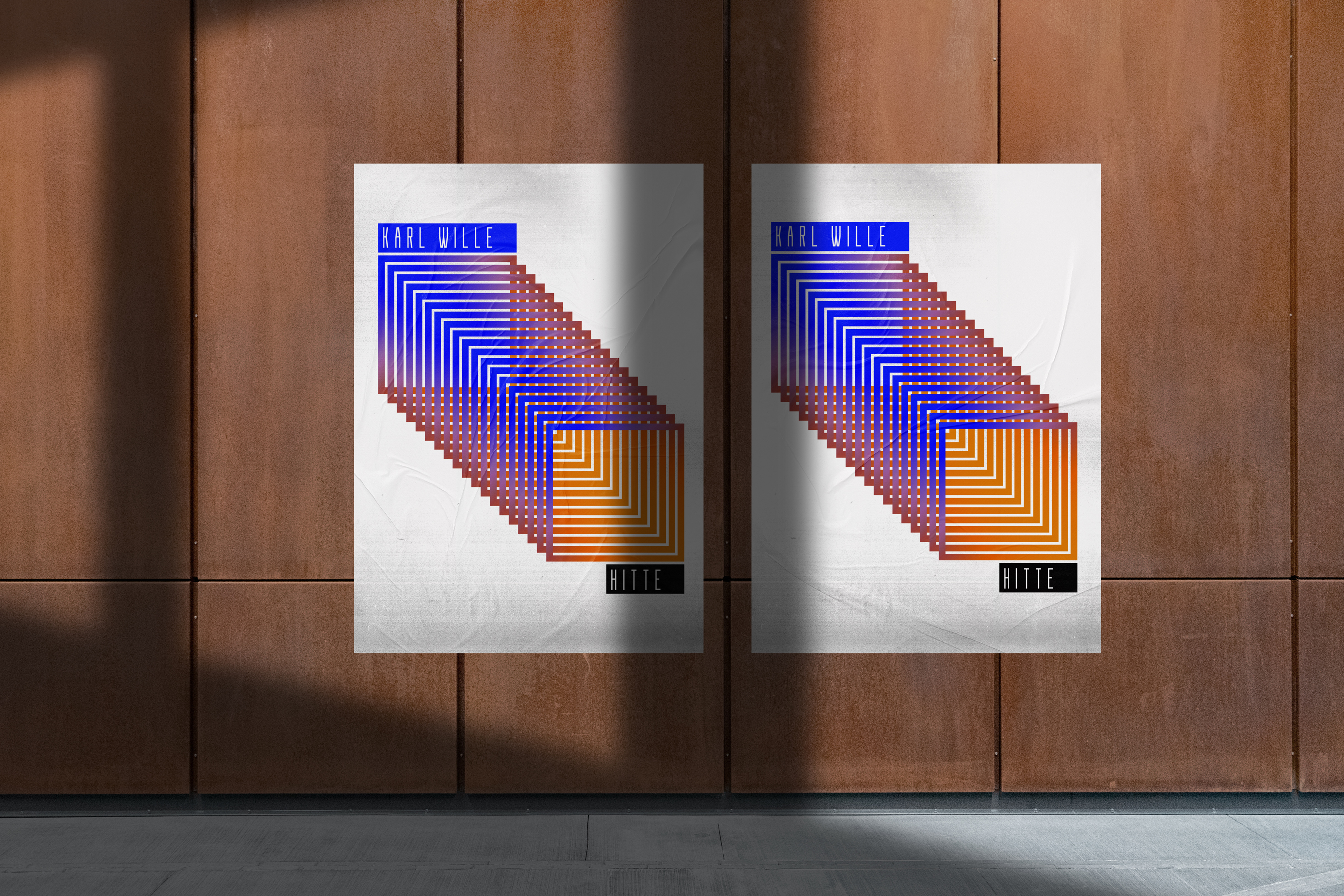
The title of the album HITTE means "heat" in Dutch, with songs named after cities like Berlin, Antwerpen, Cadzand, and Eindhoven. To define the album's graphical vibe, I created a collage of geometric figures, using holographic foil to represent the mirage phenomenon that occurs during intense heat. This design choice reflects the album's experimental-electronic music style.
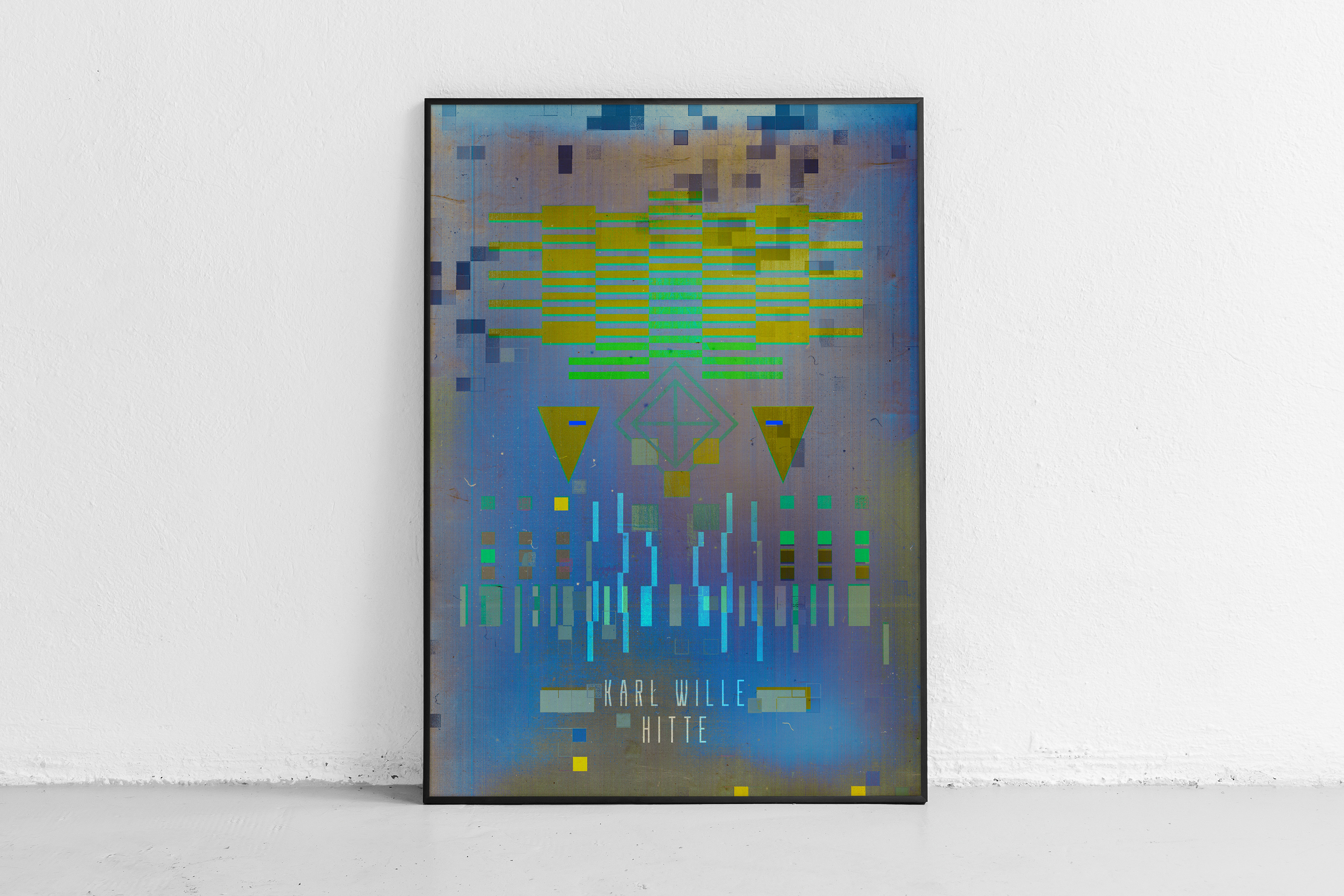
The illustrations incorporate symbols and architecture characteristic of each city, capturing the essence and associations of these places. The transparent vinyl evokes the clarity and prism-like quality of summer air. On the poster, a large element draws attention, serving as an introductory tunnel to the world of HITTE music.
The title of the album HITTE means "heat" in Dutch, with songs named after cities like Berlin, Antwerpen, Cadzand, and Eindhoven. To define the album's graphical vibe, I created a collage of geometric figures, using holographic foil to represent the mirage phenomenon that occurs during intense heat. This design choice reflects the album's experimental-electronic music style.
The illustrations incorporate symbols and architecture characteristic of each city, capturing the essence and associations of these places. The transparent vinyl evokes the clarity and prism-like quality of summer air. On the poster, a large element draws attention, serving as an introductory tunnel to the world of HITTE music.
Agency
Self-employed
Client
Karl Wille (Vincent Van Dijck)
Responsibilities
Art Direction
Visual Concept
Music Publishing Design
Album Cover
Packaging Design
Graphic Design
Illustration
Typography
Poster & Print Design
Self-employed
Client
Karl Wille (Vincent Van Dijck)
Responsibilities
Art Direction
Visual Concept
Music Publishing Design
Album Cover
Packaging Design
Graphic Design
Illustration
Typography
Poster & Print Design


Other works︎︎︎