Art Direction and Design for an exclusive pop-up event in Berlin to promote the debut of Tesla Cybertruck (invitation only). The pitched project includes the idea for the location, name of the event with logo design, and branding (posters, landing page, event invitation, collateral, etc.).
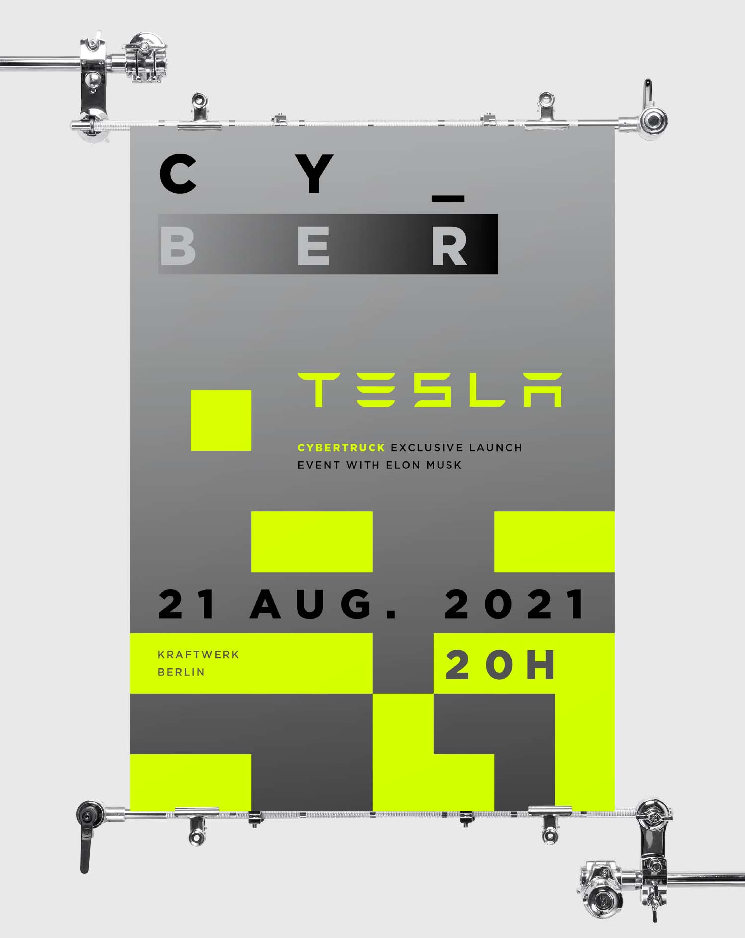
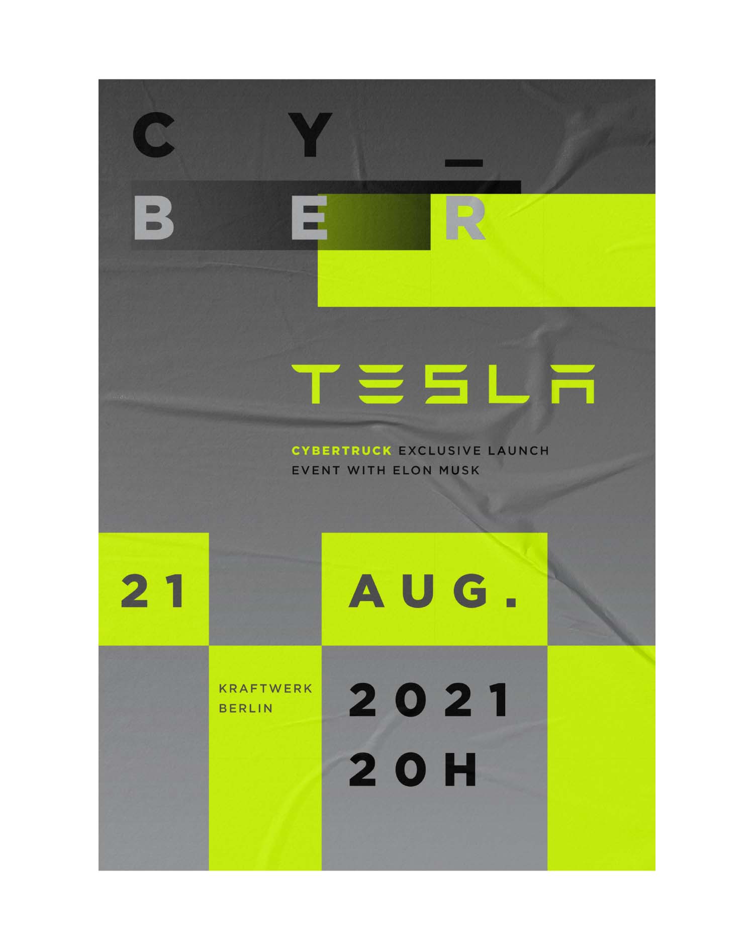
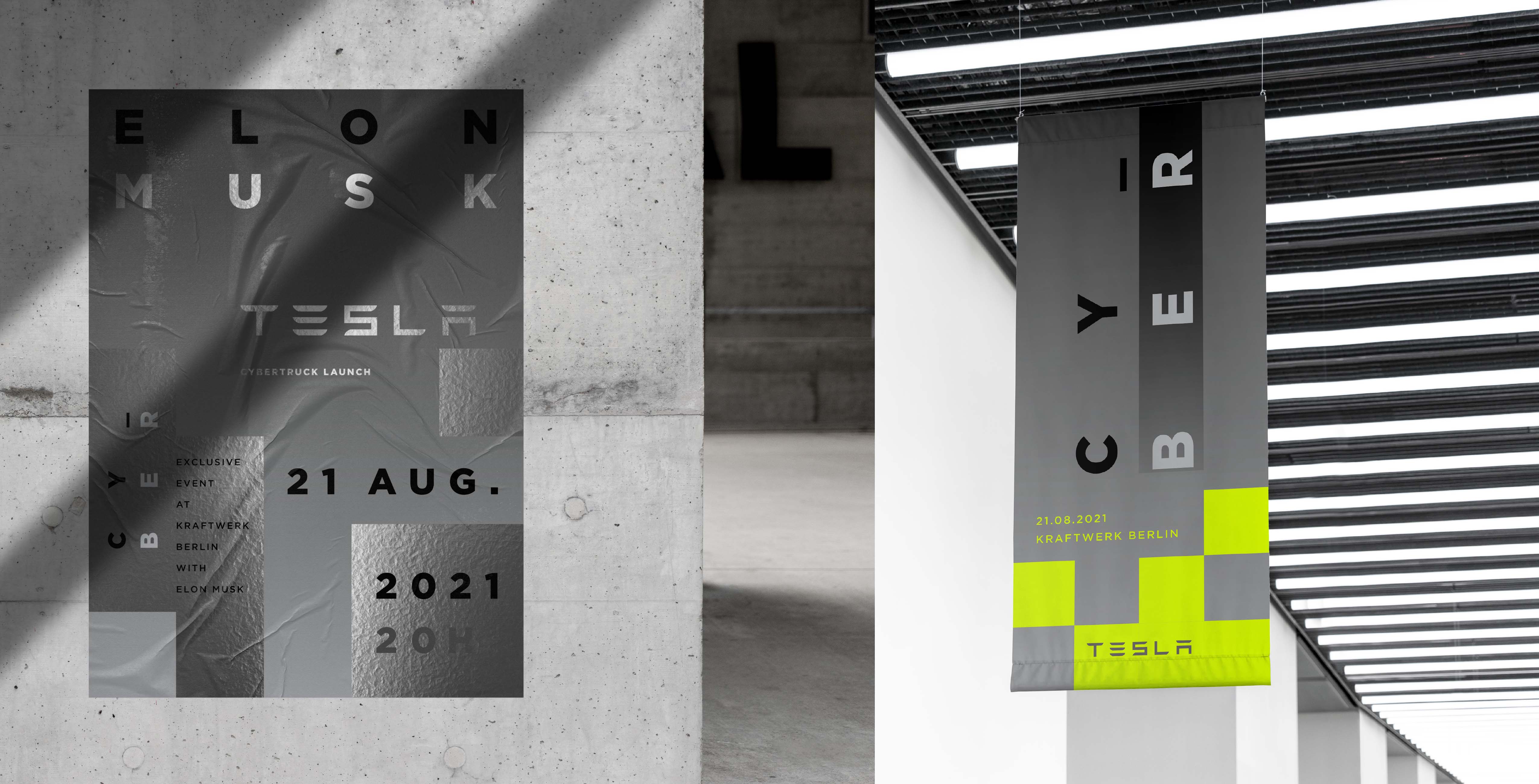
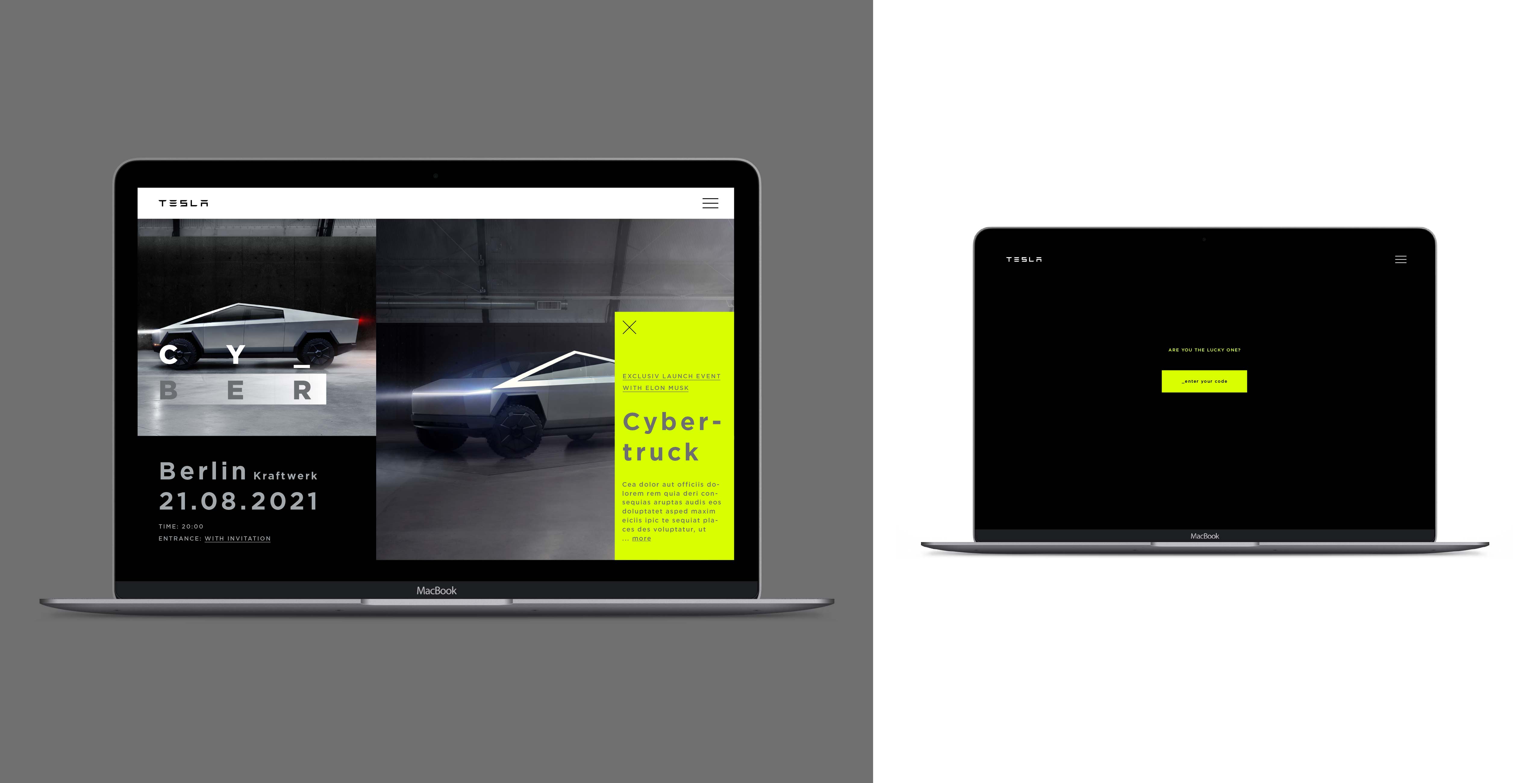
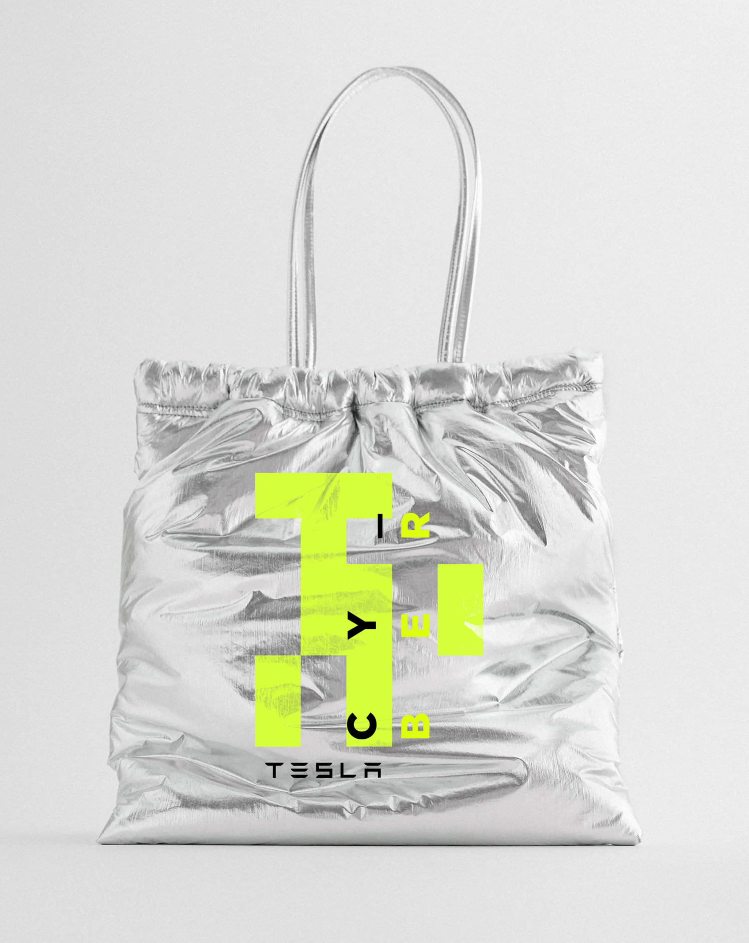
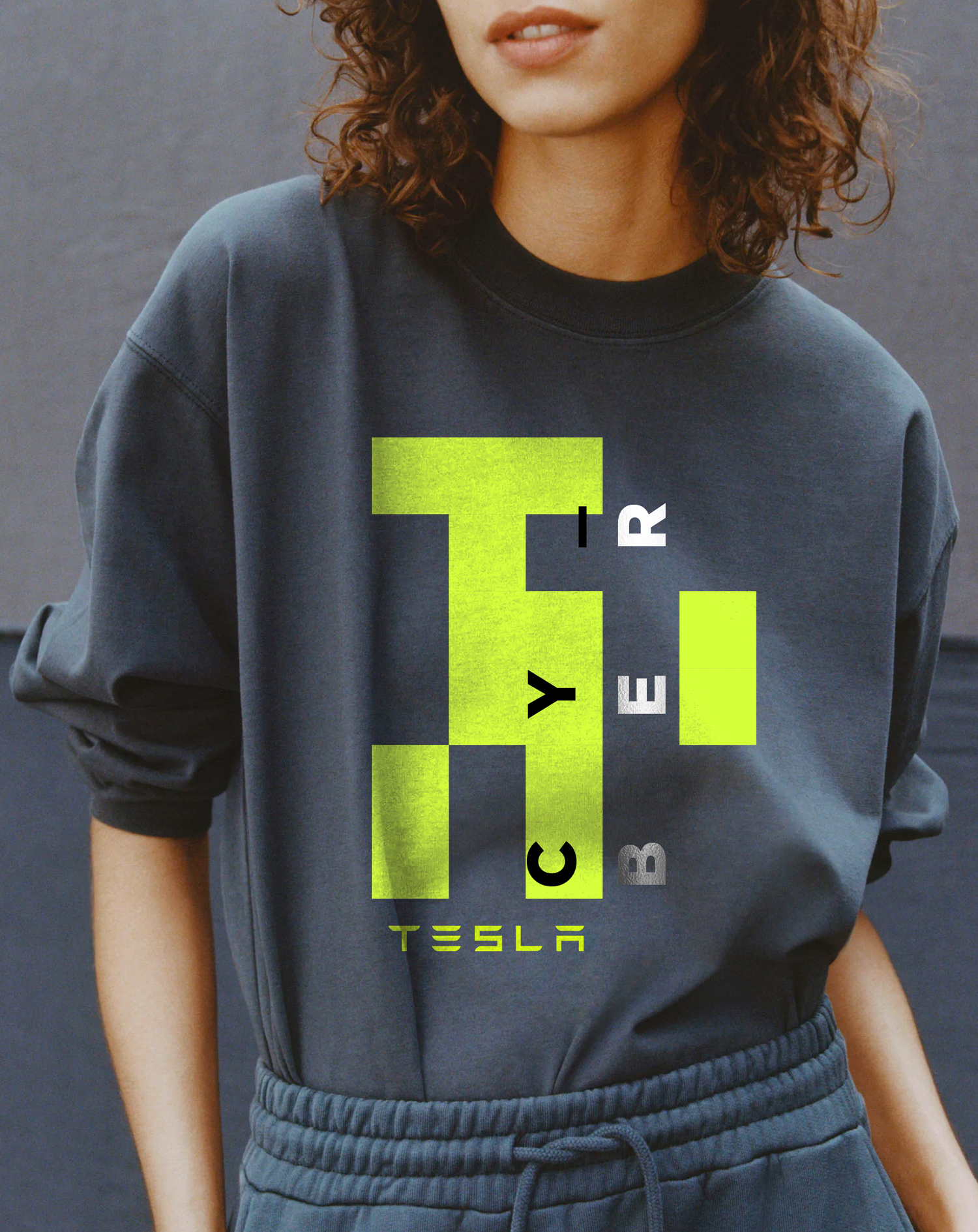
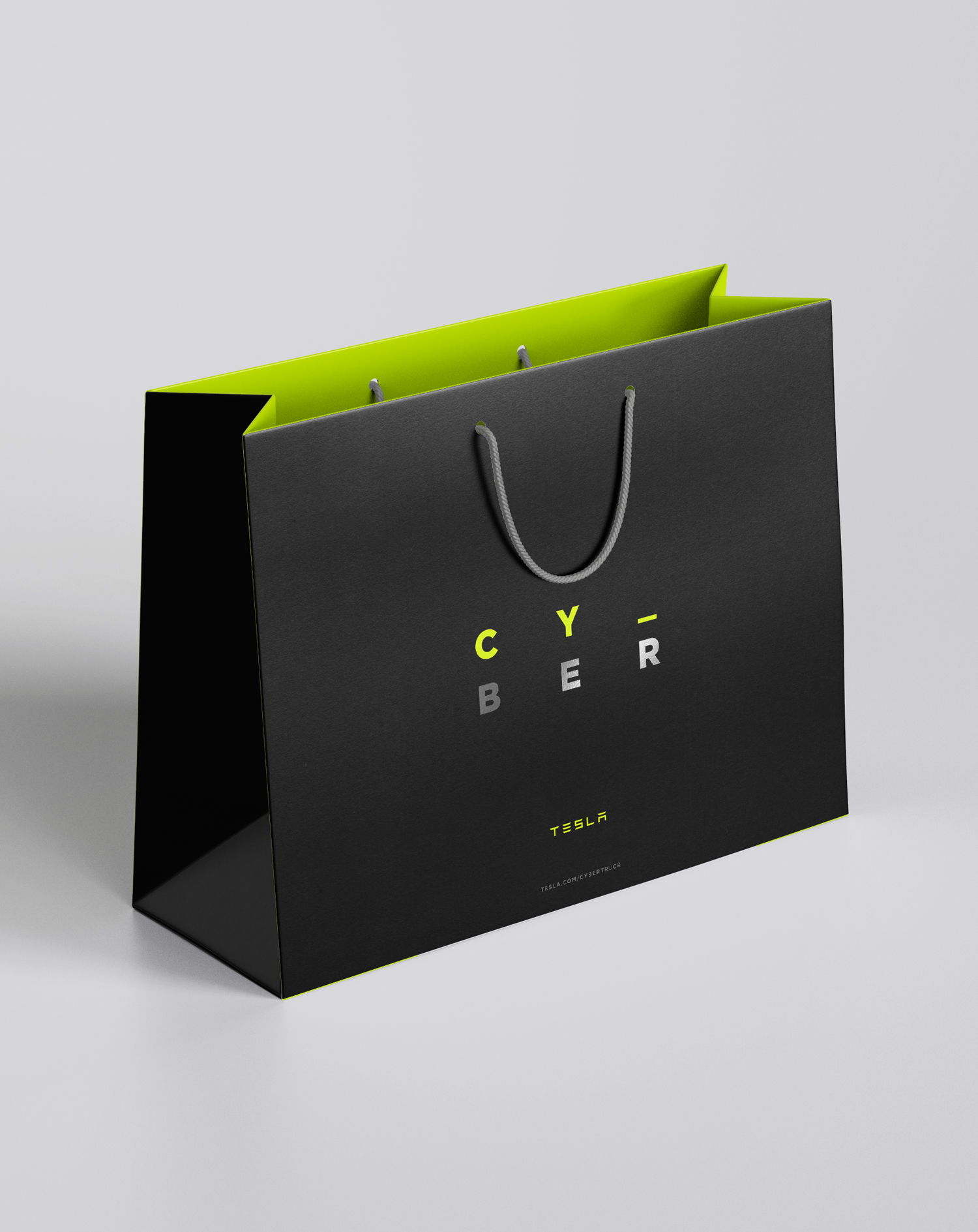
The inspiration for the Key Visual pop-up event comes from the minimalist cyber-aesthetics, as well as the form and materials of the Cybertruck itself. Key Visual is based on geometric, square forms, which reflect the silhouette of the car, glitch effect, pixels, and grid. Colors are raw, enhanced with energetic yellow color accents, and with a premium silver foil finish. Materials used in the project are sustainable, just like Tesla cars and brand philosophy. 2021.
The inspiration for the Key Visual pop-up event comes from the minimalist cyber-aesthetics, as well as the form and materials of the Cybertruck itself. Key Visual is based on geometric, square forms, which reflect the silhouette of the car, glitch effect, pixels, and grid. Colors are raw, enhanced with energetic yellow color accents, and with a premium silver foil finish. Materials used in the project are sustainable, just like Tesla cars and brand philosophy. 2021.
Agency
Self-employed
Client
pitch idea for Tesla
Self-employed
Client
pitch idea for Tesla
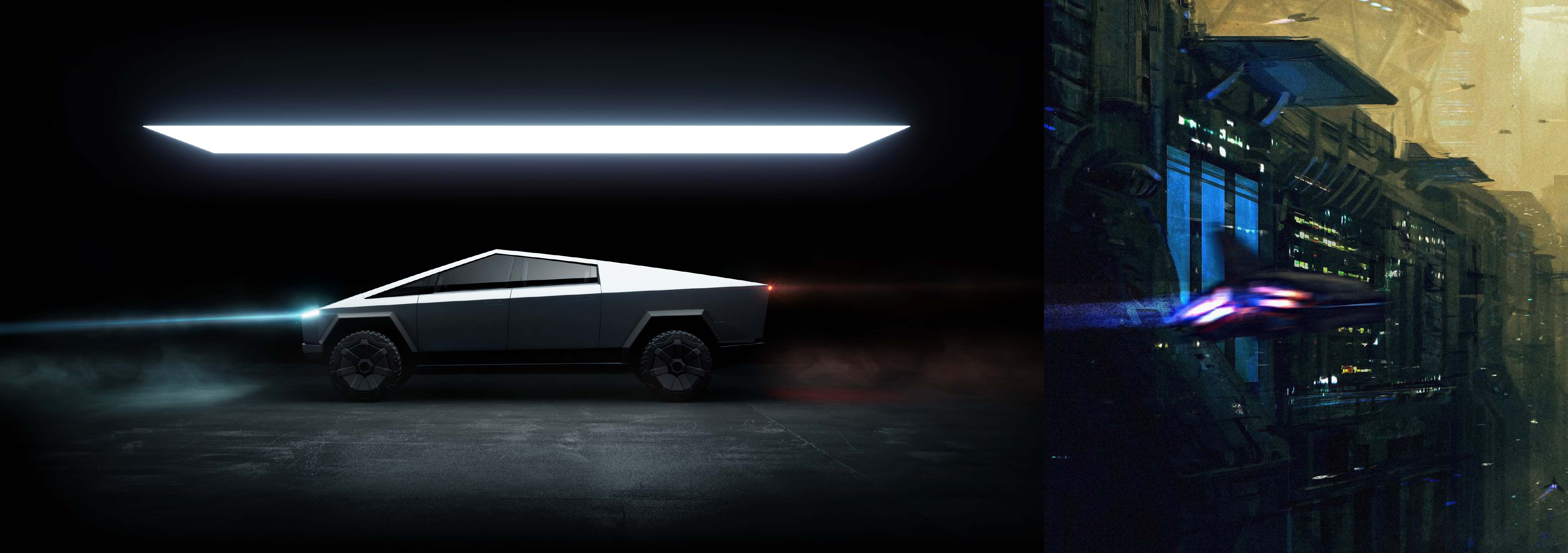
Tesla Cybertruck combines the utility of a truck with the performance of the sports car, and a futuristic design. It reminds me the best science fiction movies.
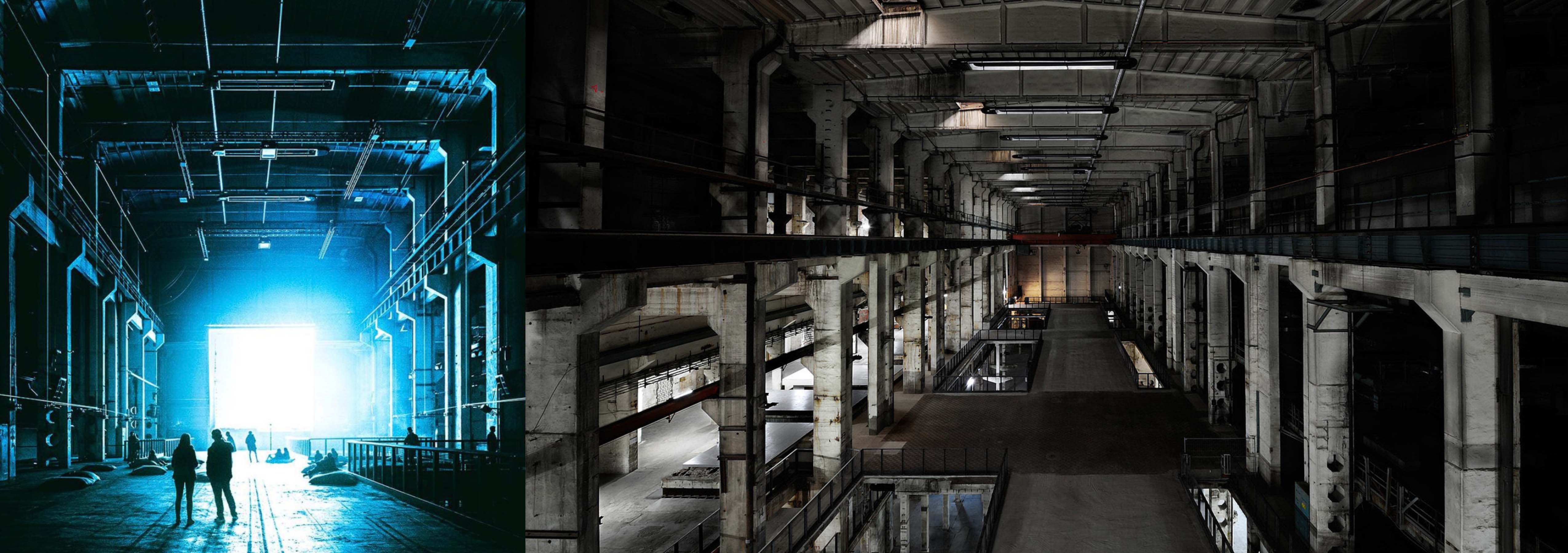
My idea for the event location was Kraftwerk Berlin. Not only the history of the building as a former power plant refers to Cybertruck, as a car powered by electric energy. Its concrete and industrial rough interior would be a perfect setting for the introduction of Cybertruck, completing the visual whole.

EXECUTION
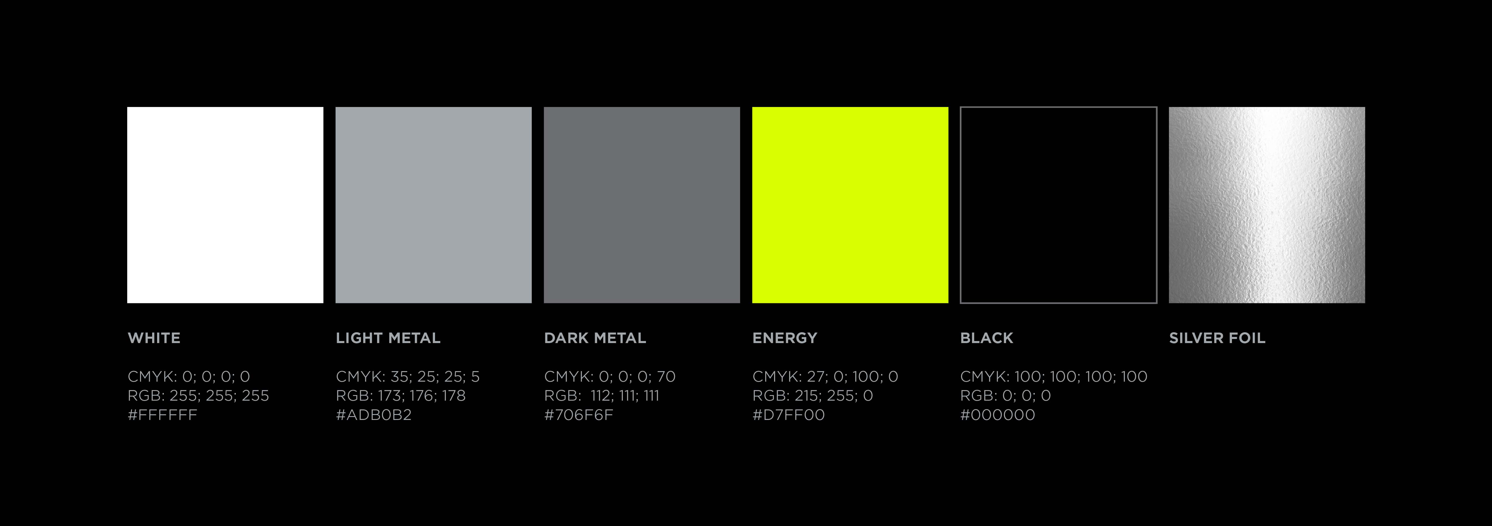
The shades of grey color and silver-matt foil refer to the materials used in the body of Cybertruck, while yellow refers to electricity, and as the most luminous color, it attracts our attention to the event.
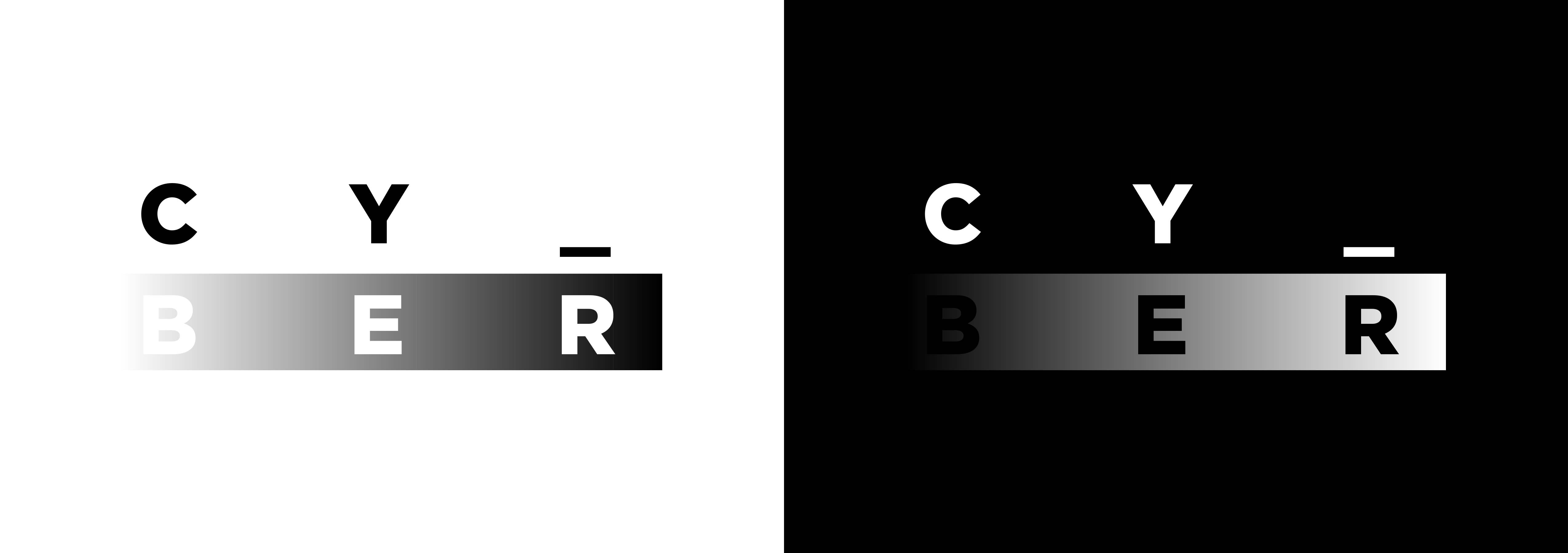
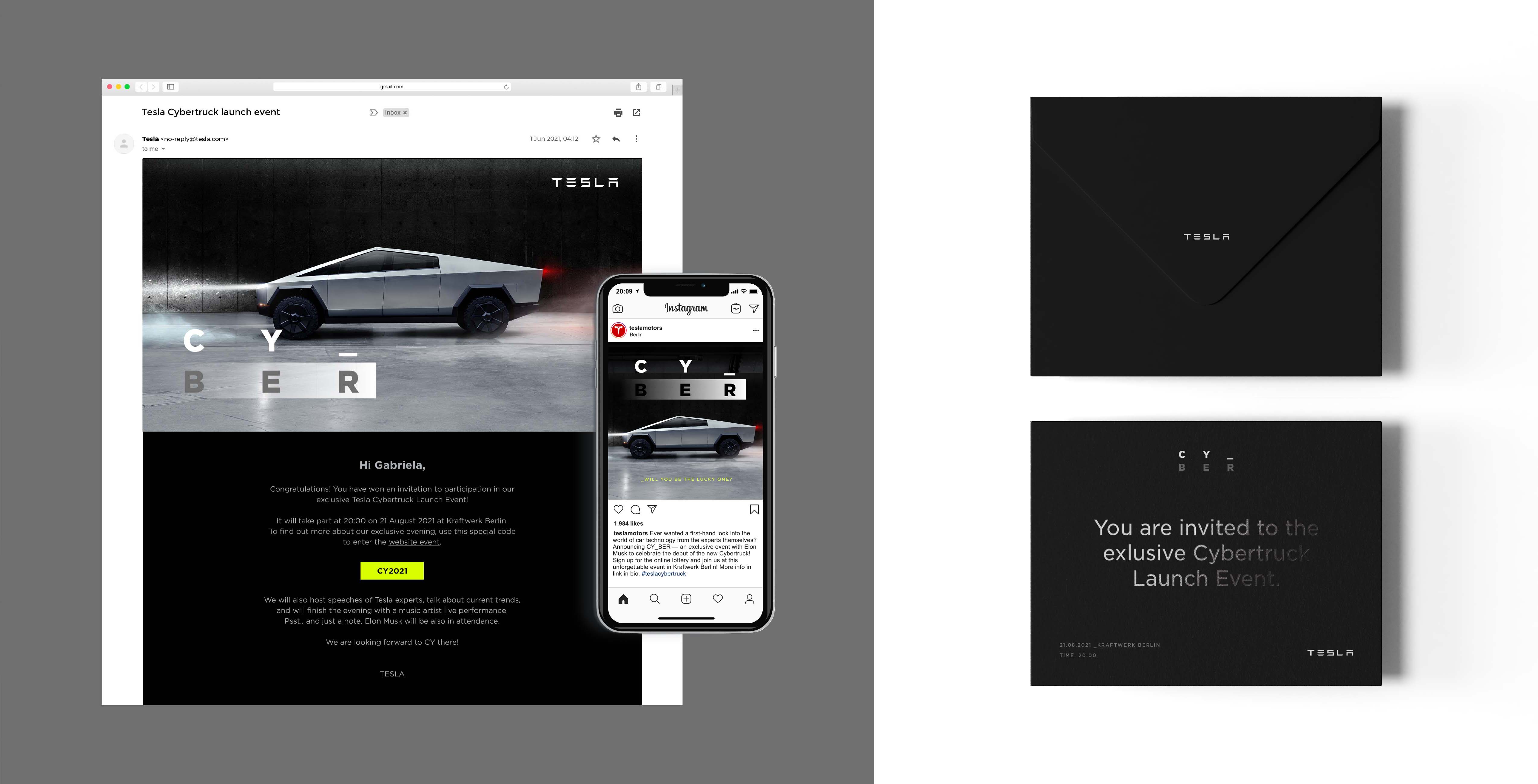
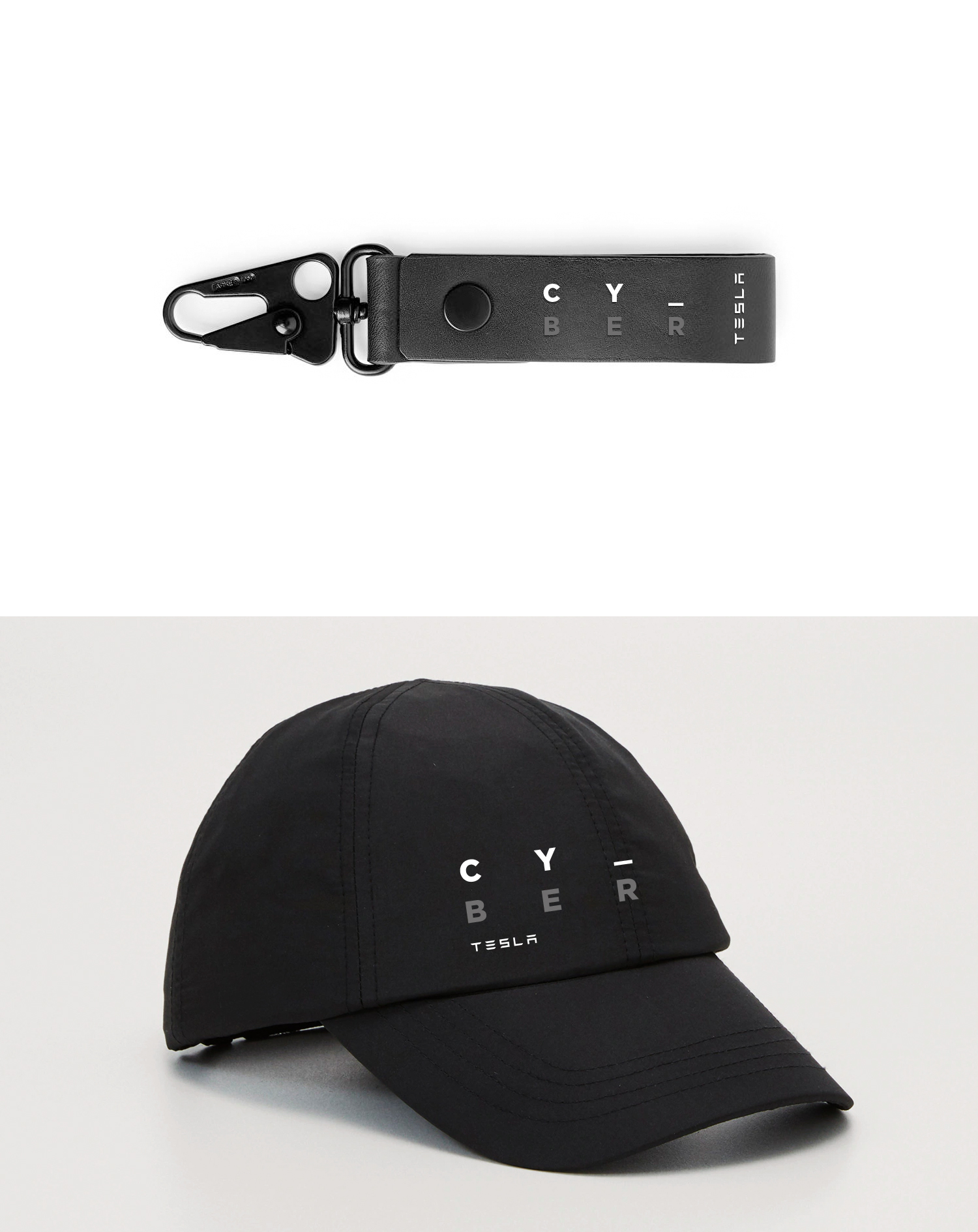
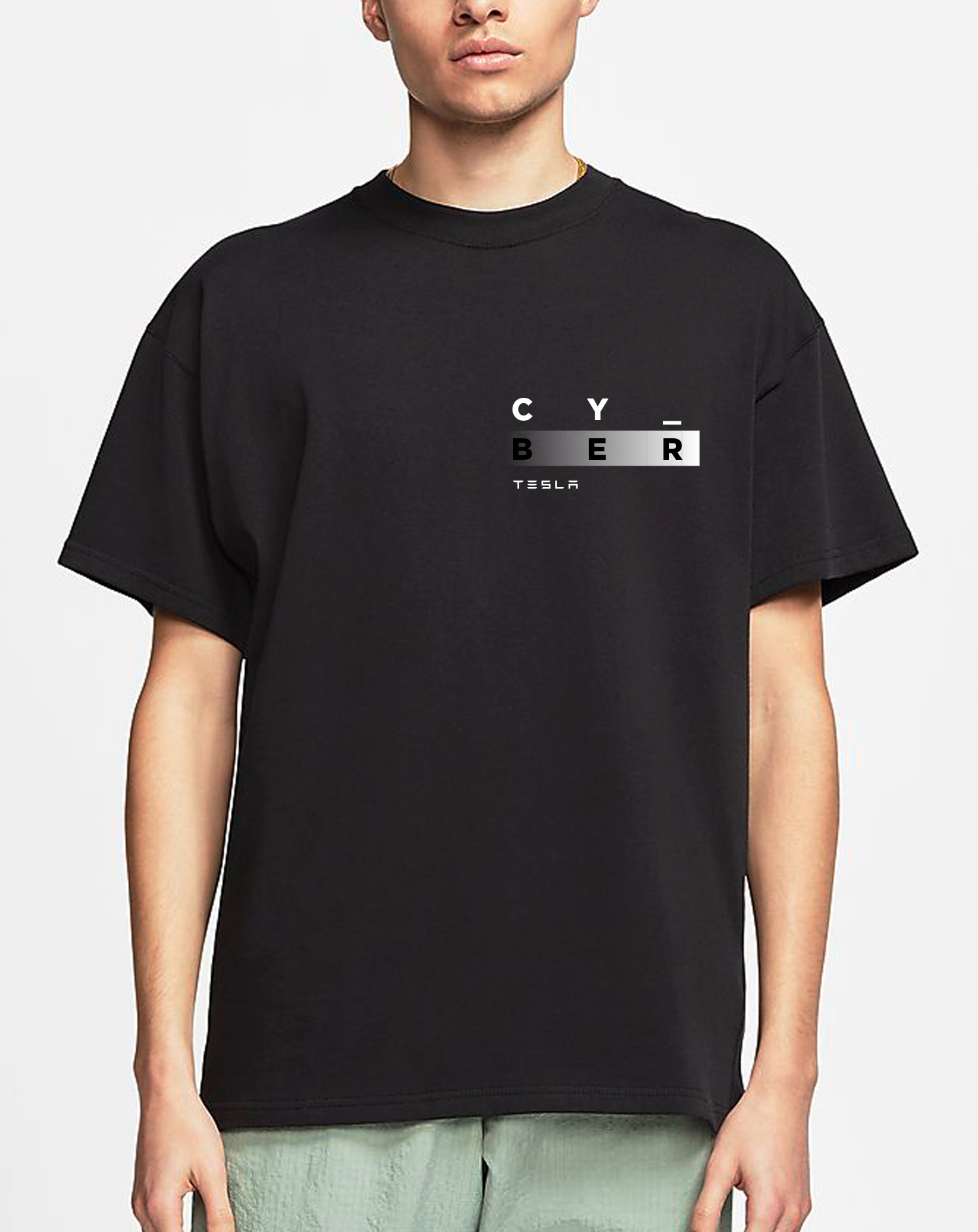
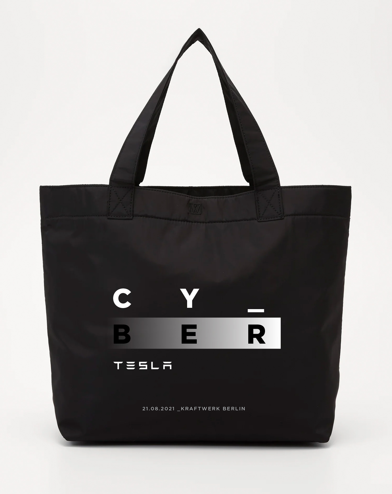
CY_ in a virtual language stands for the abbreviation of See You, whereas BER stands for the short form of the Berlin word. The logo has therefore a double meaning. Through name CY_BER I wanted to refer not only to the name of the new Tesla car — Cybertruck, but also show an inviting form — See You Berlin, as the city in which the car would be presented.

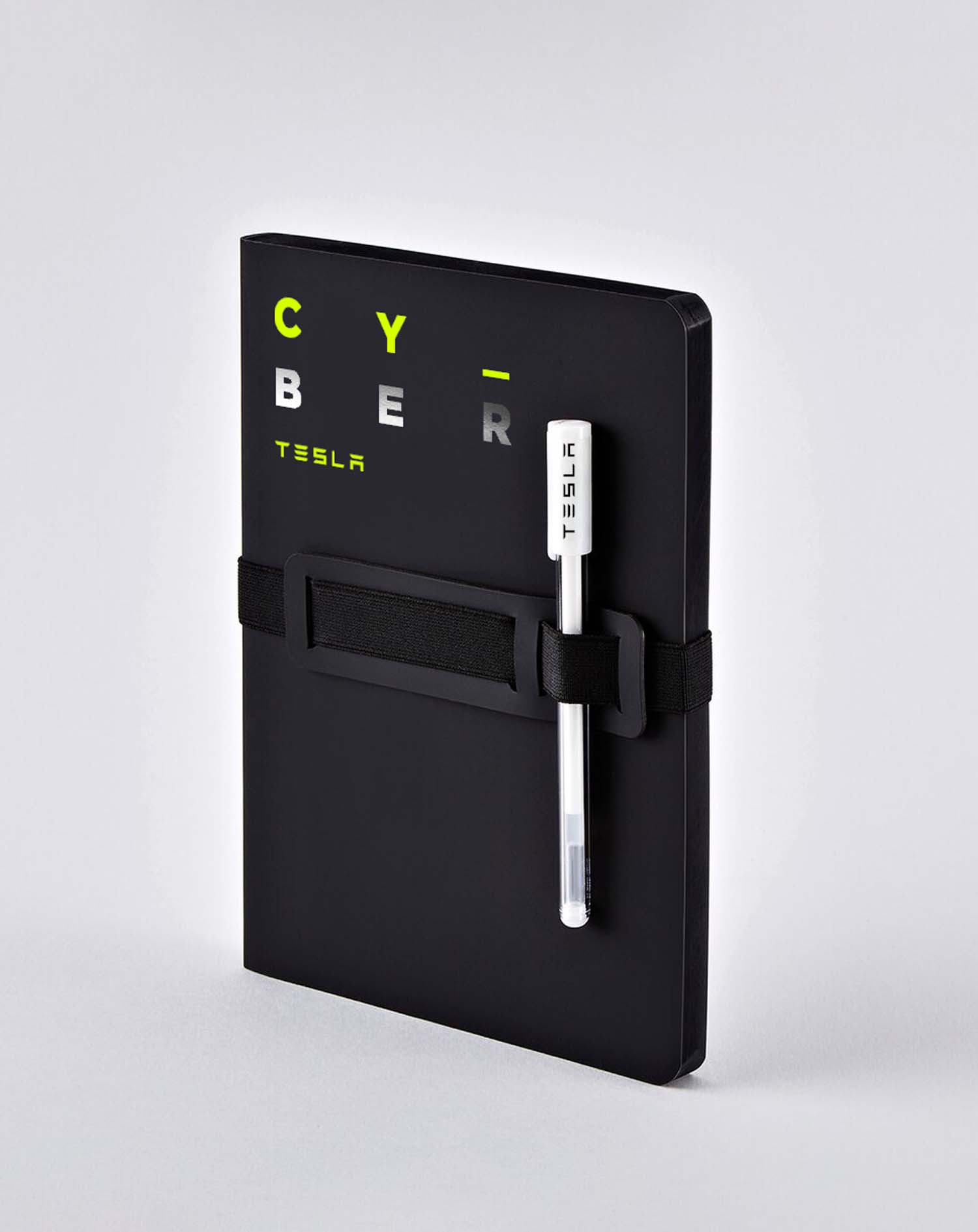
Notebook with black paper and white or silver ink pen.
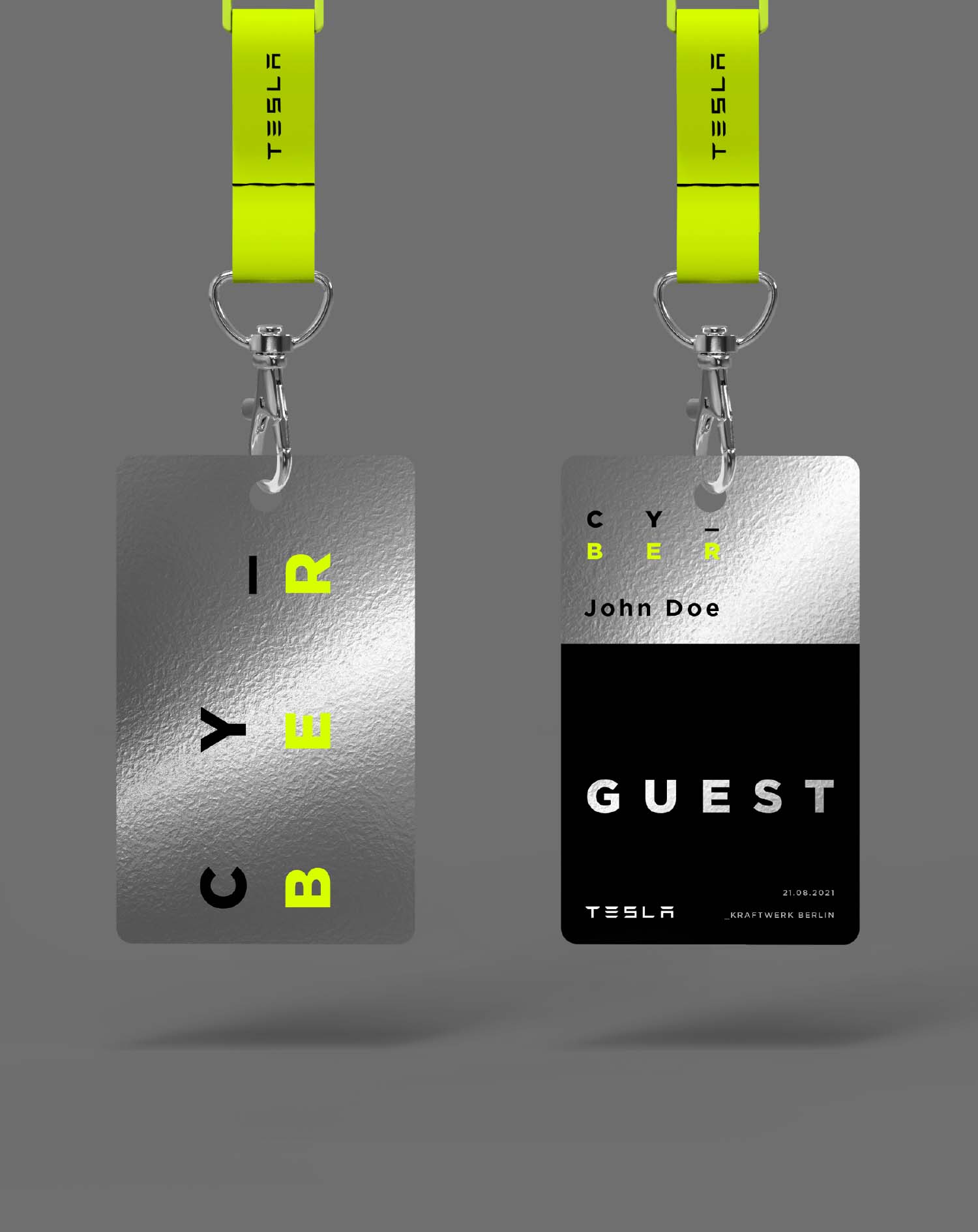
Exclusive ID Cards. The idea was to use metal or aluminum as material of the cards to connect to the car body and show an exclusive character of this event.
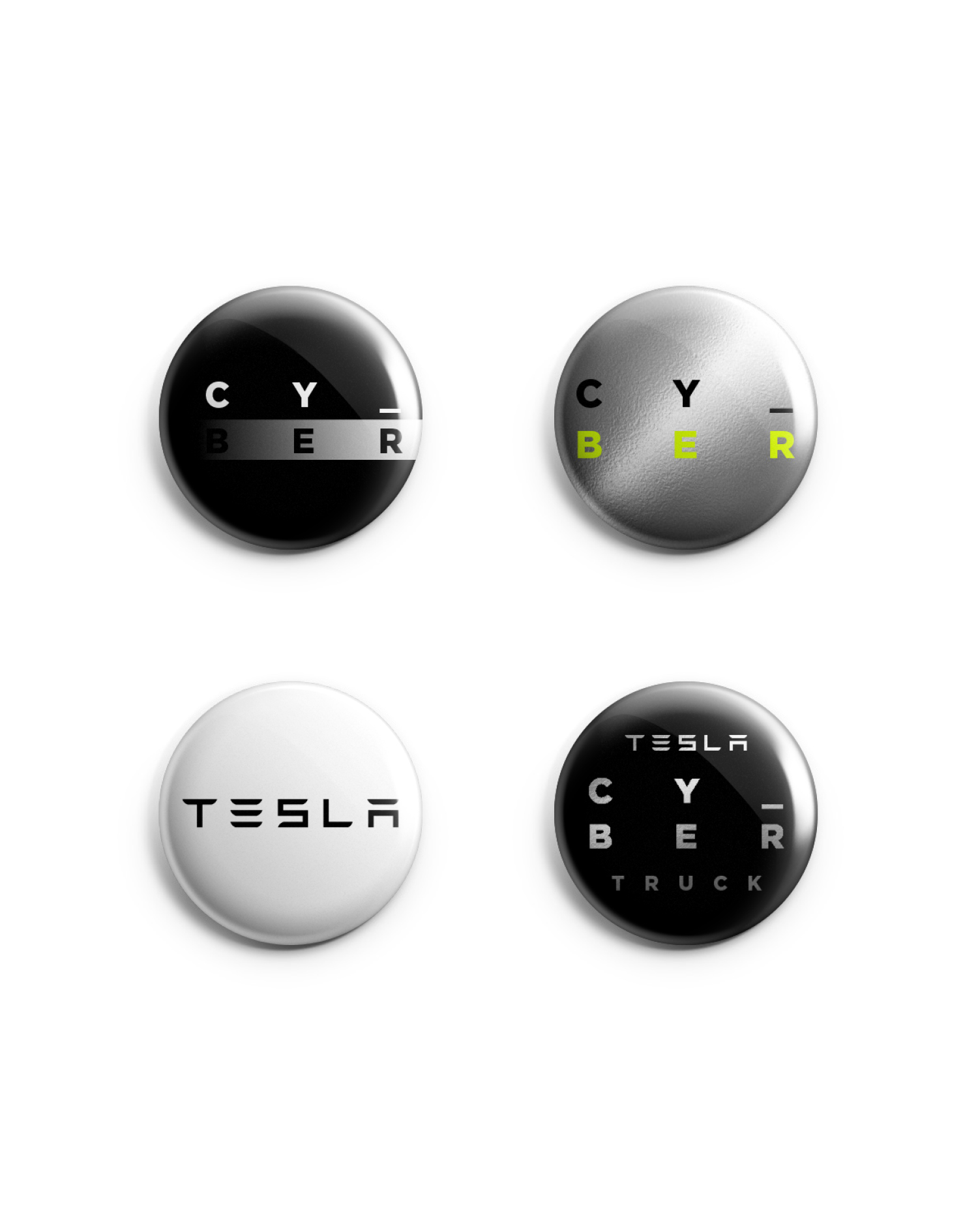

Event wristbands made out of 100% recyclable Tyvek®. Apart from merchandise like t-shirts, pin buttons or tote bags, my additional idea for an exclusive giveaway was an iPhone case made out of fully compostable material (eg. Pela case).
Other works︎︎︎
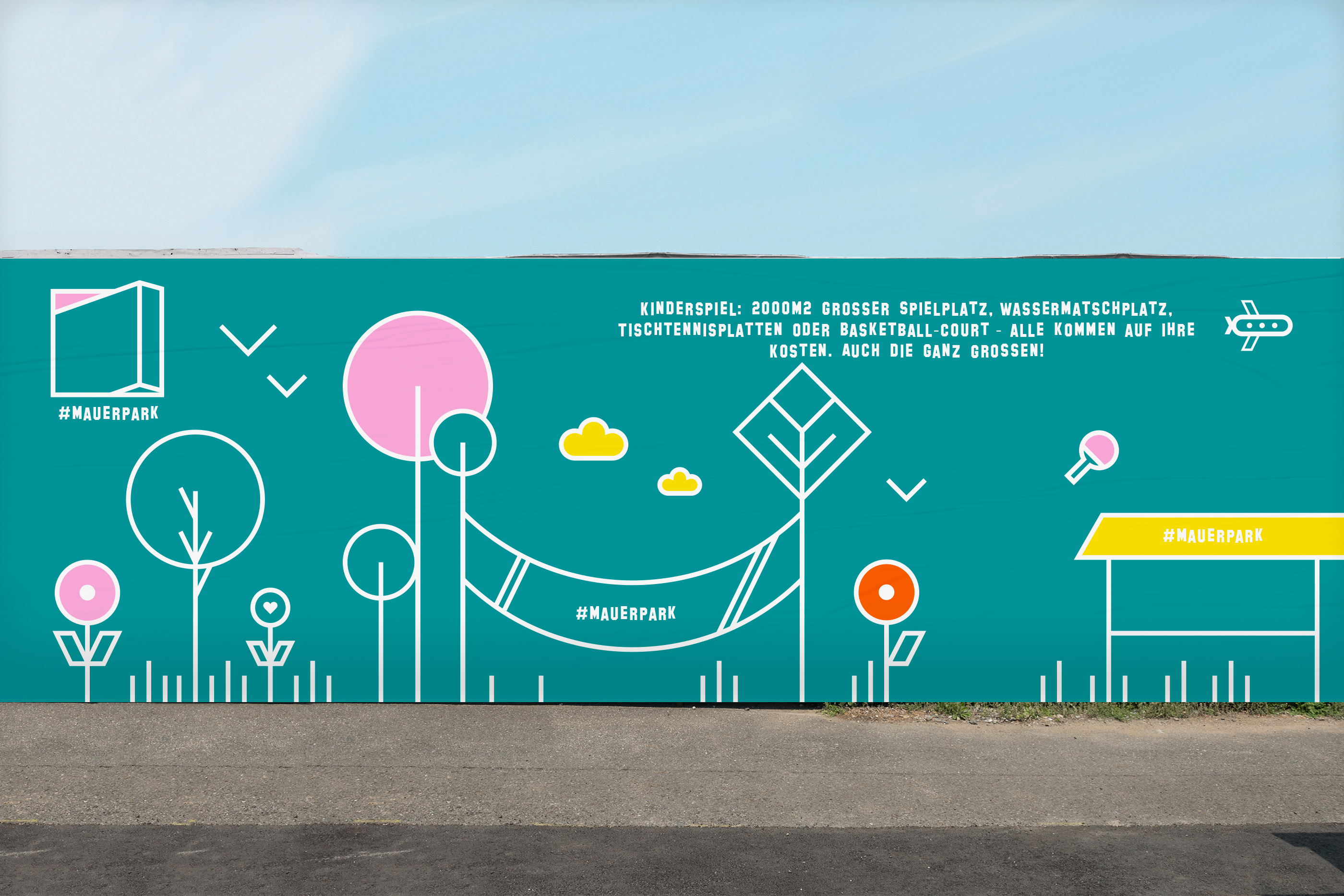
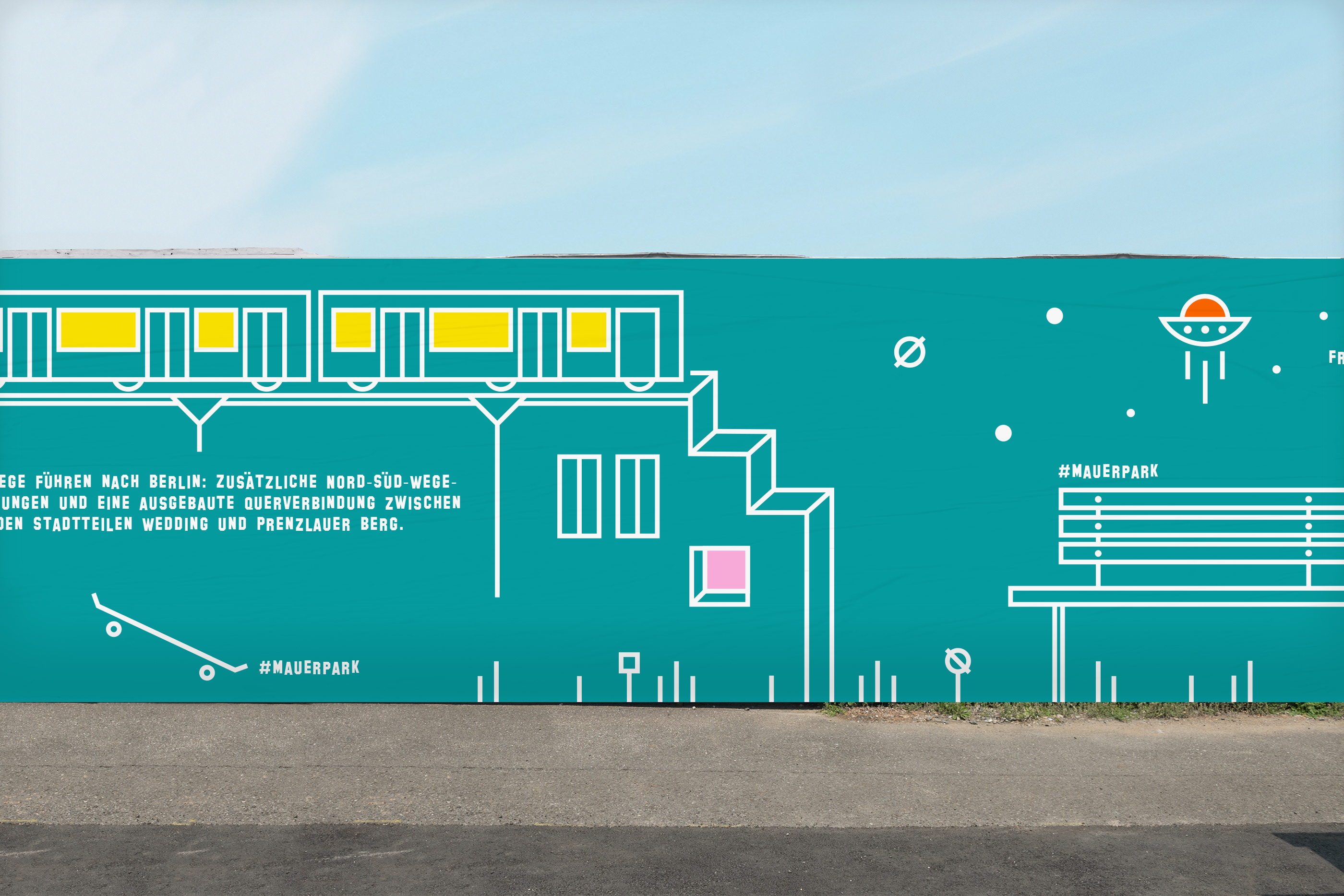
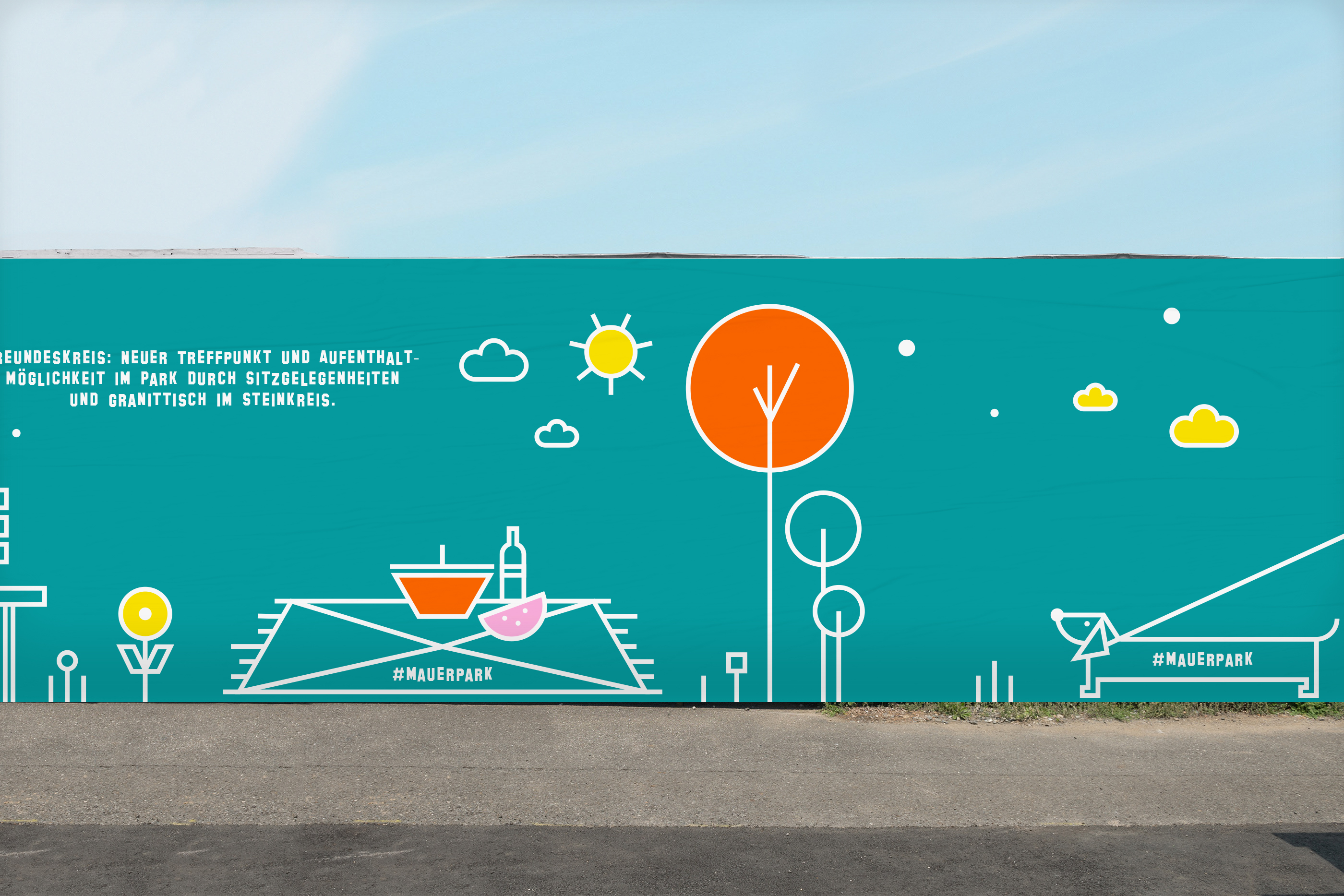
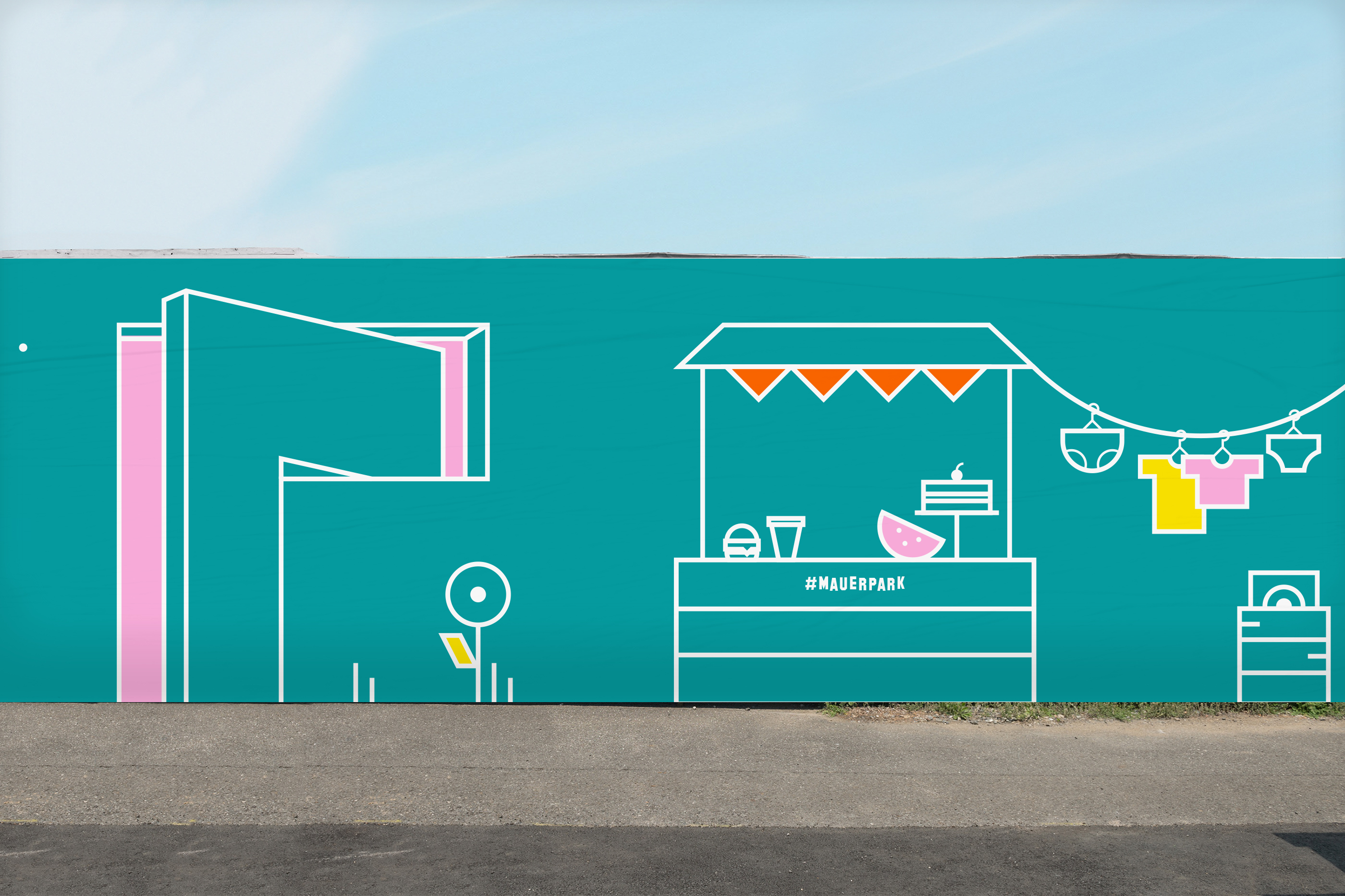
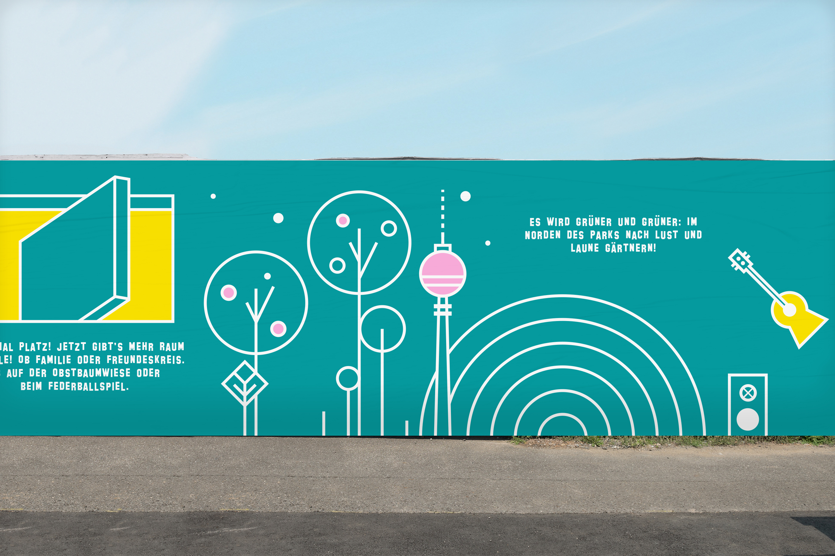
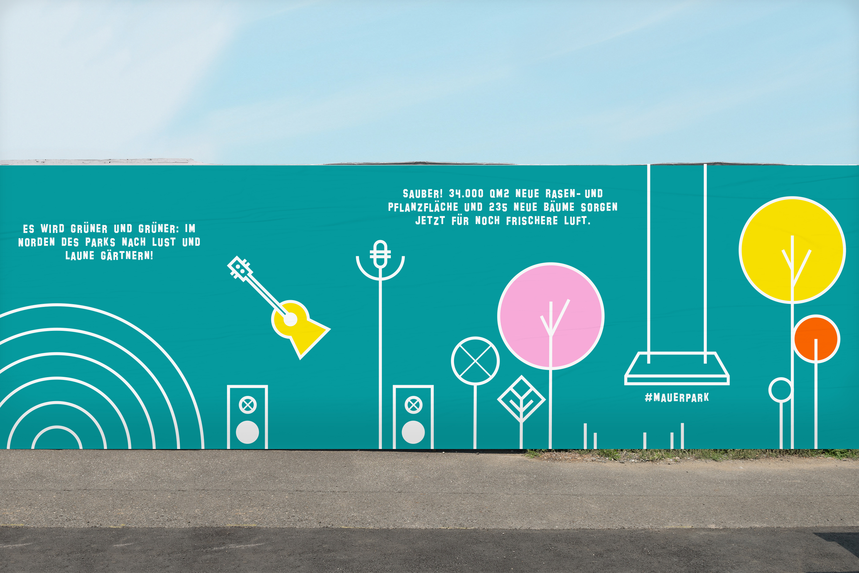
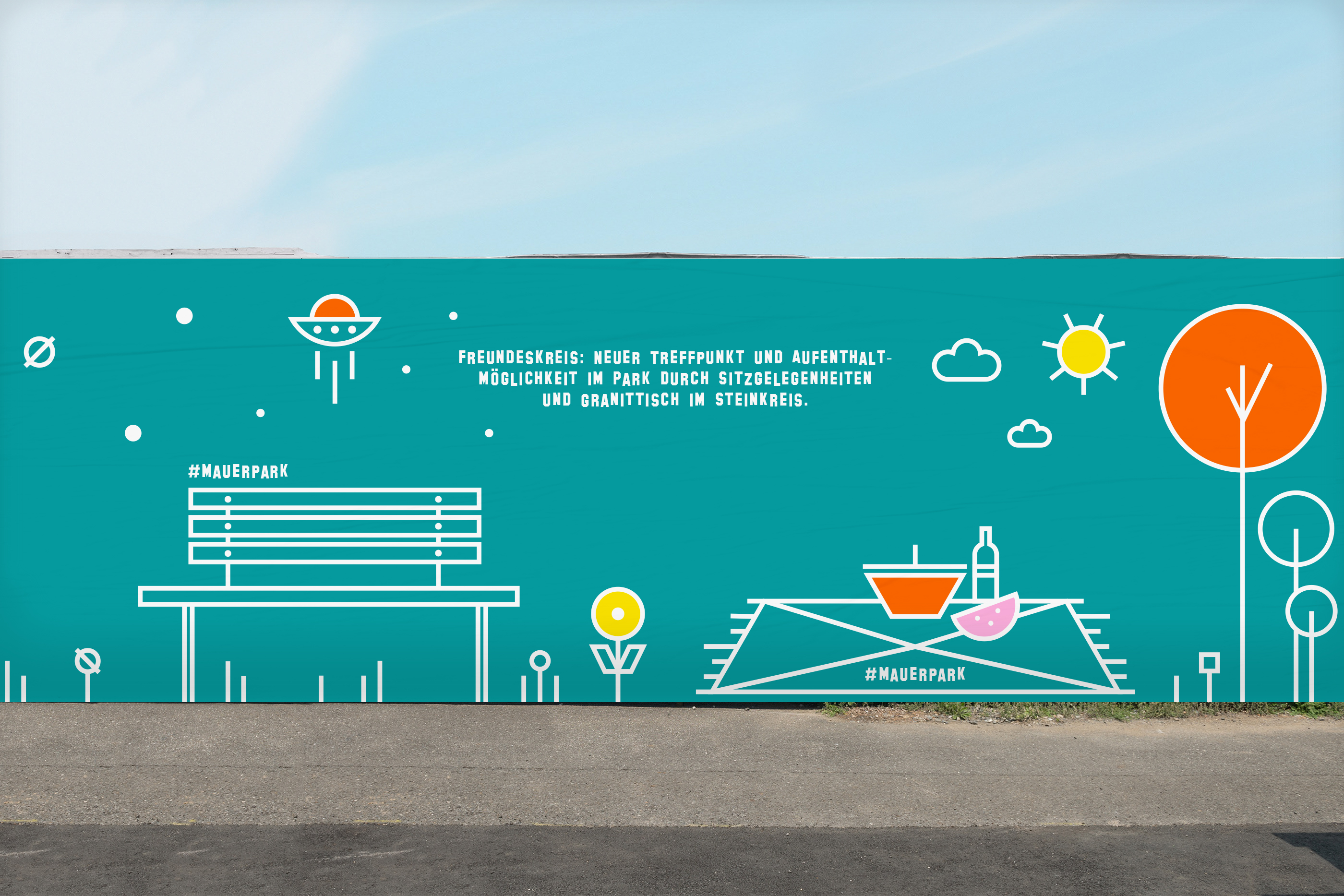
Art Direction and illustrations for the Mauerpark Berlin construction-site fence. The construction site took place at the end of 2020. The total length of the fence and graphic design created for it was over 50 meters. The geometric shapes of the layout are inspired by tape art. Flat graphics are combined with 3D-looking elements, which create depth and are a metaphor for changes in the Mauerpark.
The main elements that illustrate features of the Mauerpark and its nearest neighborhoods like Prenzlauer Berg run through the whole Design.
The design is also Instagrammable and can be used as a selfie wall. 2020.
The main elements that illustrate features of the Mauerpark and its nearest neighborhoods like Prenzlauer Berg run through the whole Design.
The design is also Instagrammable and can be used as a selfie wall. 2020.
Agency
Spring. Brandideas
Client
Grün Berlin
Spring. Brandideas
Client
Grün Berlin


Other works︎︎︎
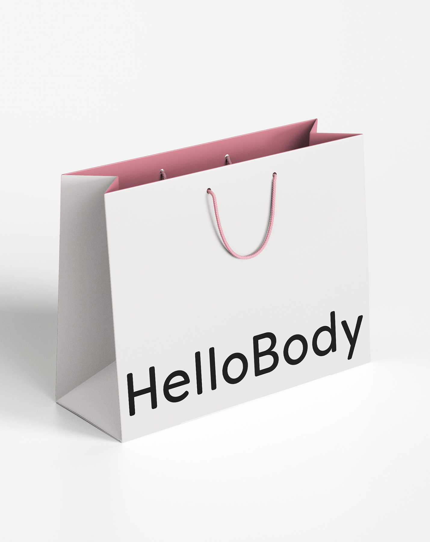
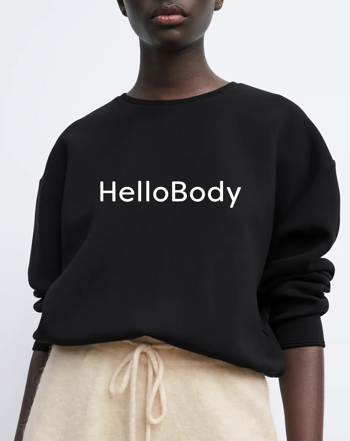
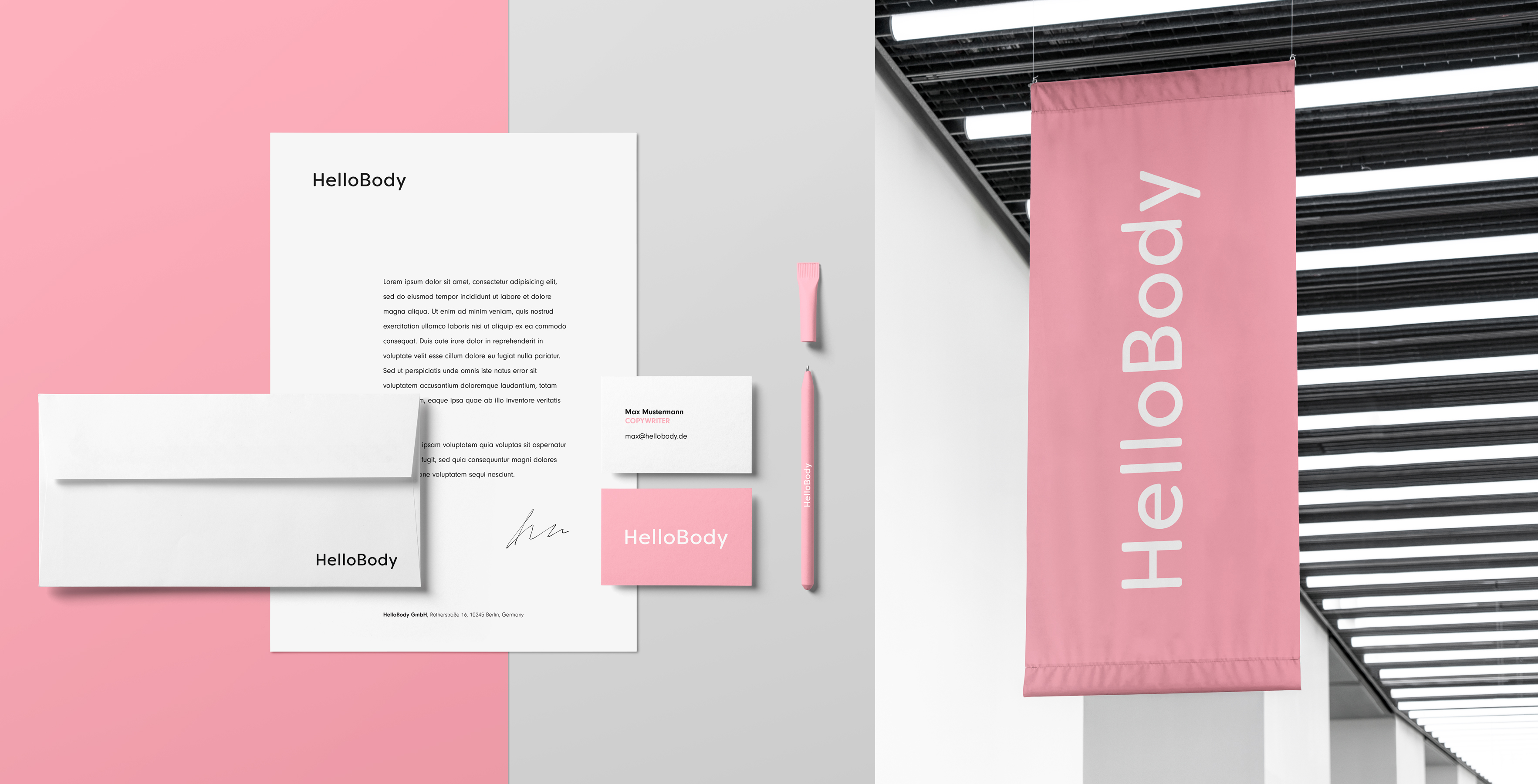
HelloBody is a vegan skincare pioneer brand from Berlin that has been on the beauty market since 2015. Over time, the company has developed and grown with its loyal clients. In 2023, the brand decided to refresh its image and vision. The new motto is 'Less is More Skin', which embodies the belief in removing the noise around skincare and focusing on what really matters - the skin.
In this project, I was responsible for the creative and art direction, design, and refresh of the visual identity. I worked on the entire process, from defining the brand direction and visual mood, to organising and overseeing the photo shoot and working on the final design assets. 2023
Photography by: Adam Koziol
Agency
Grenion Brands
Client
HelloBody
Grenion Brands
Client
HelloBody
The refreshed version of the logo consists of only the wordmark as the main logo, giving the brand a more mature look and signifying the new brand values. The kerning of the letters has been adjusted - less space between the letters makes the logo more compact and prominent.

NEW ICONS STYLE


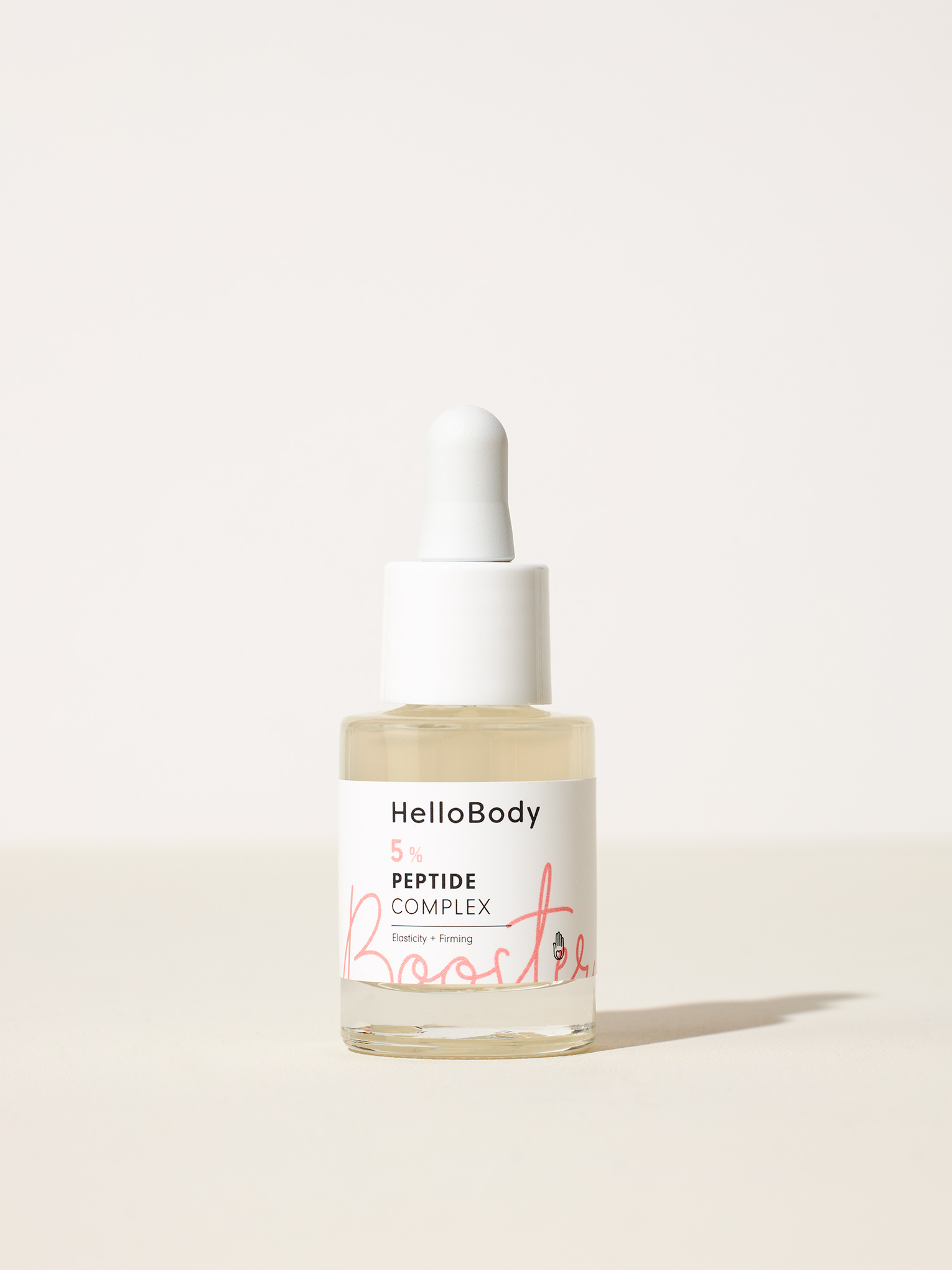


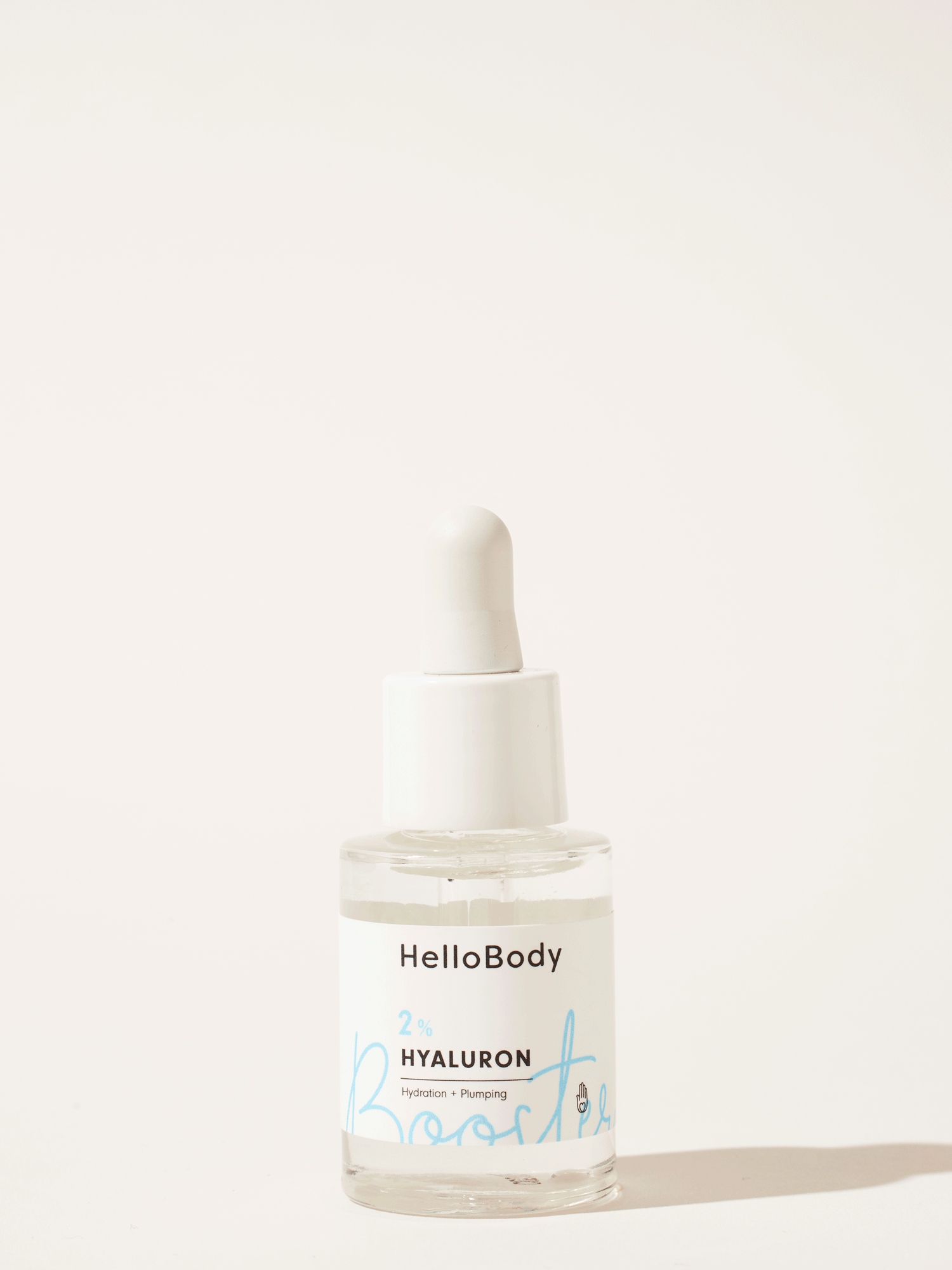
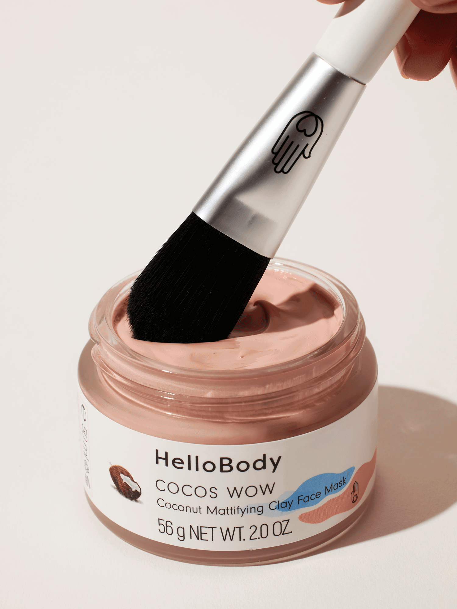
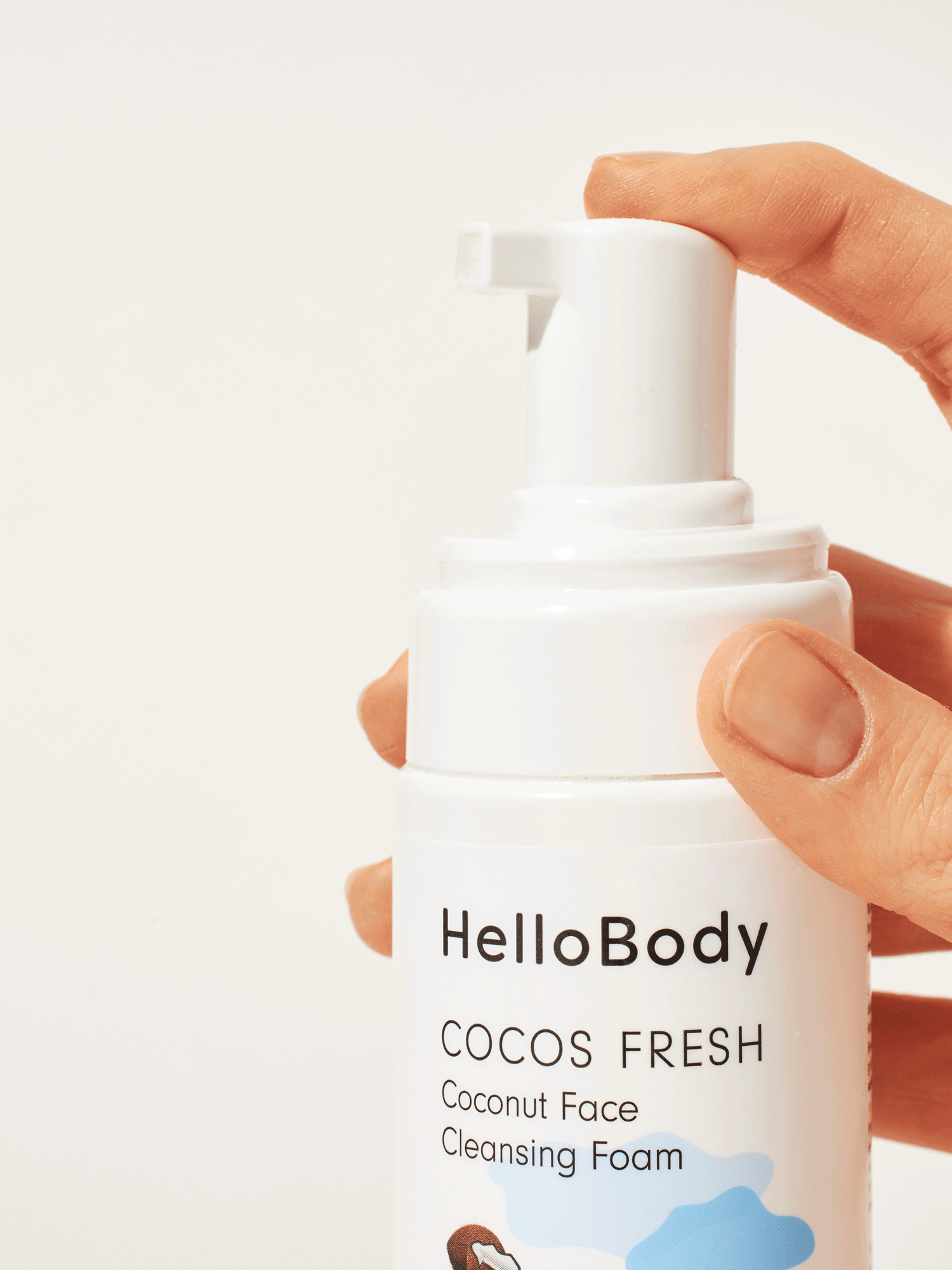
PACKSHOTS & GIFS: The products are now photographed with studio lighting on a natural beige background and with a front perspective.
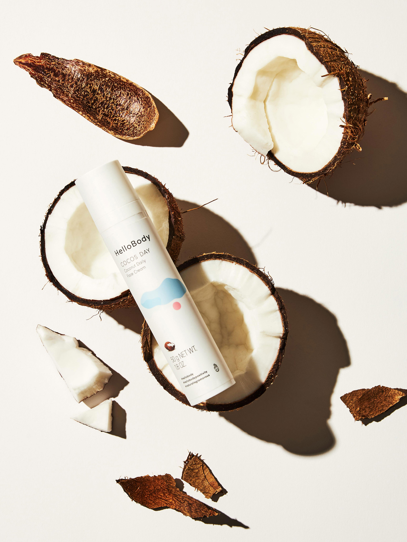

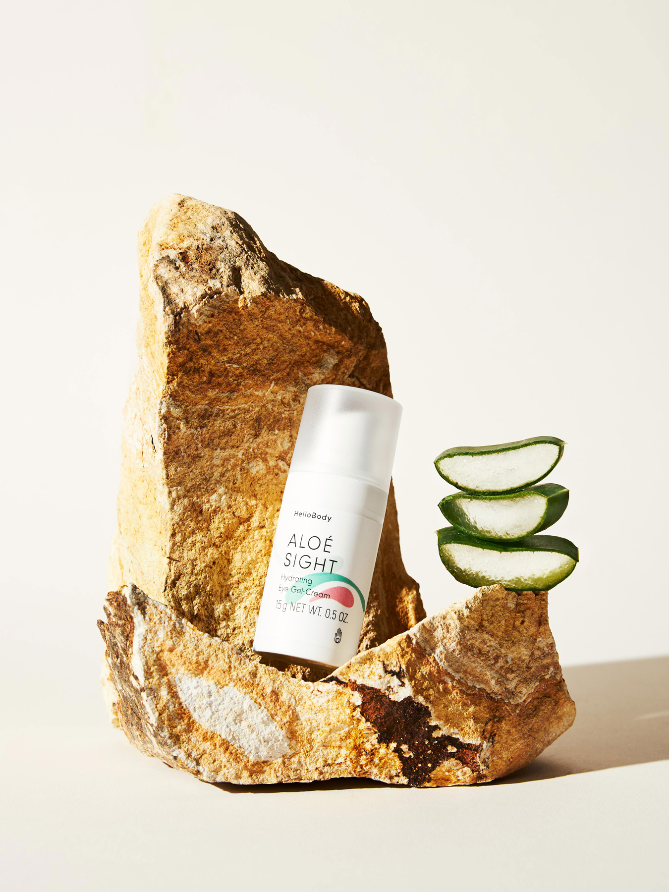


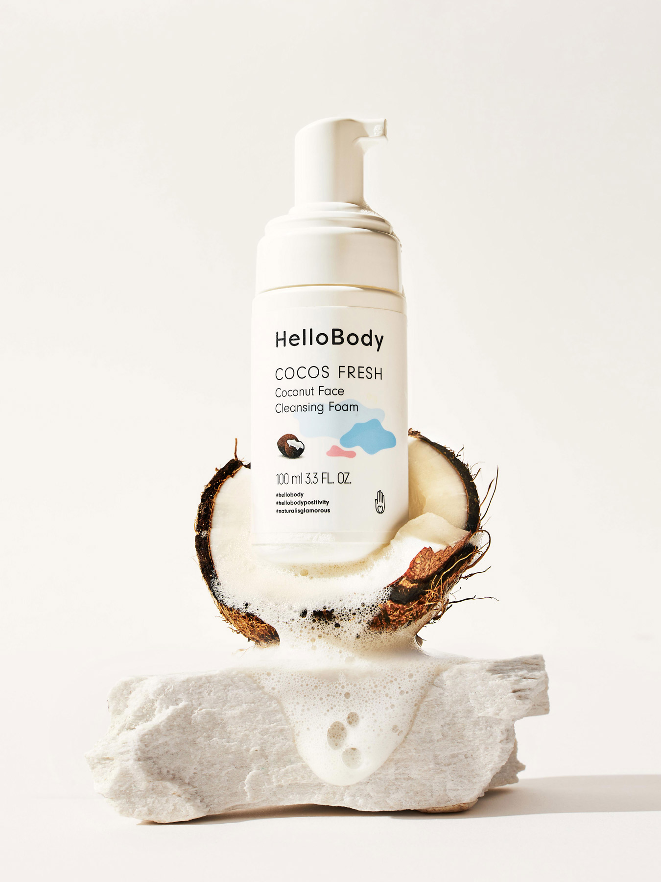

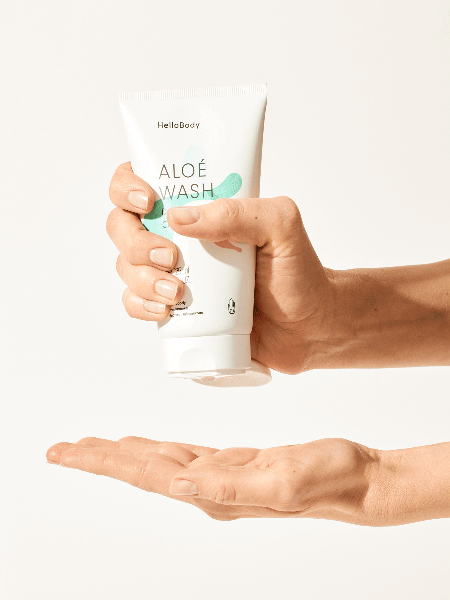
LIFESTYLE PHOTOGRAPHY: Lifestyle product photography uses natural colours, elements and product ingredients as part of the scenography.


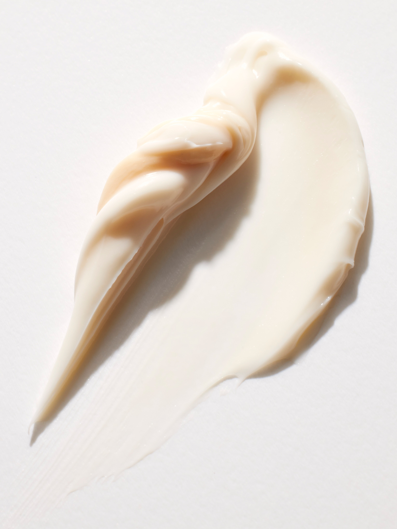


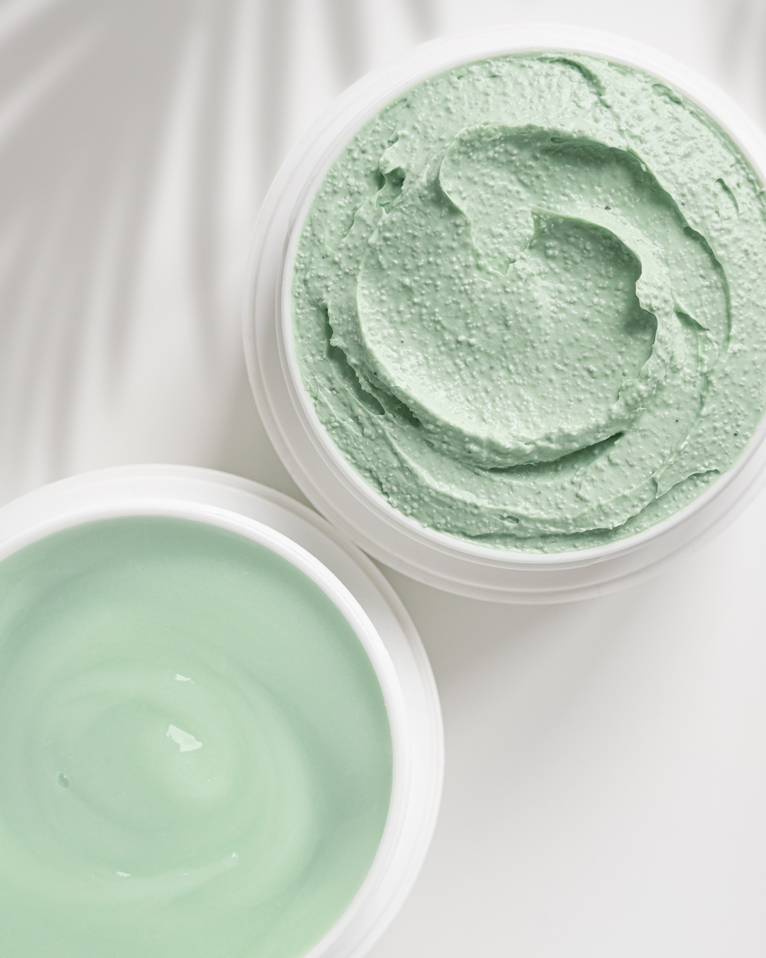
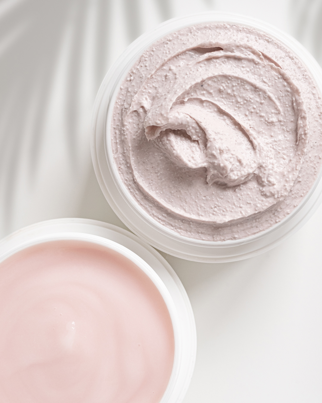
TEXTURES: Product consistency shown in an appealing way.


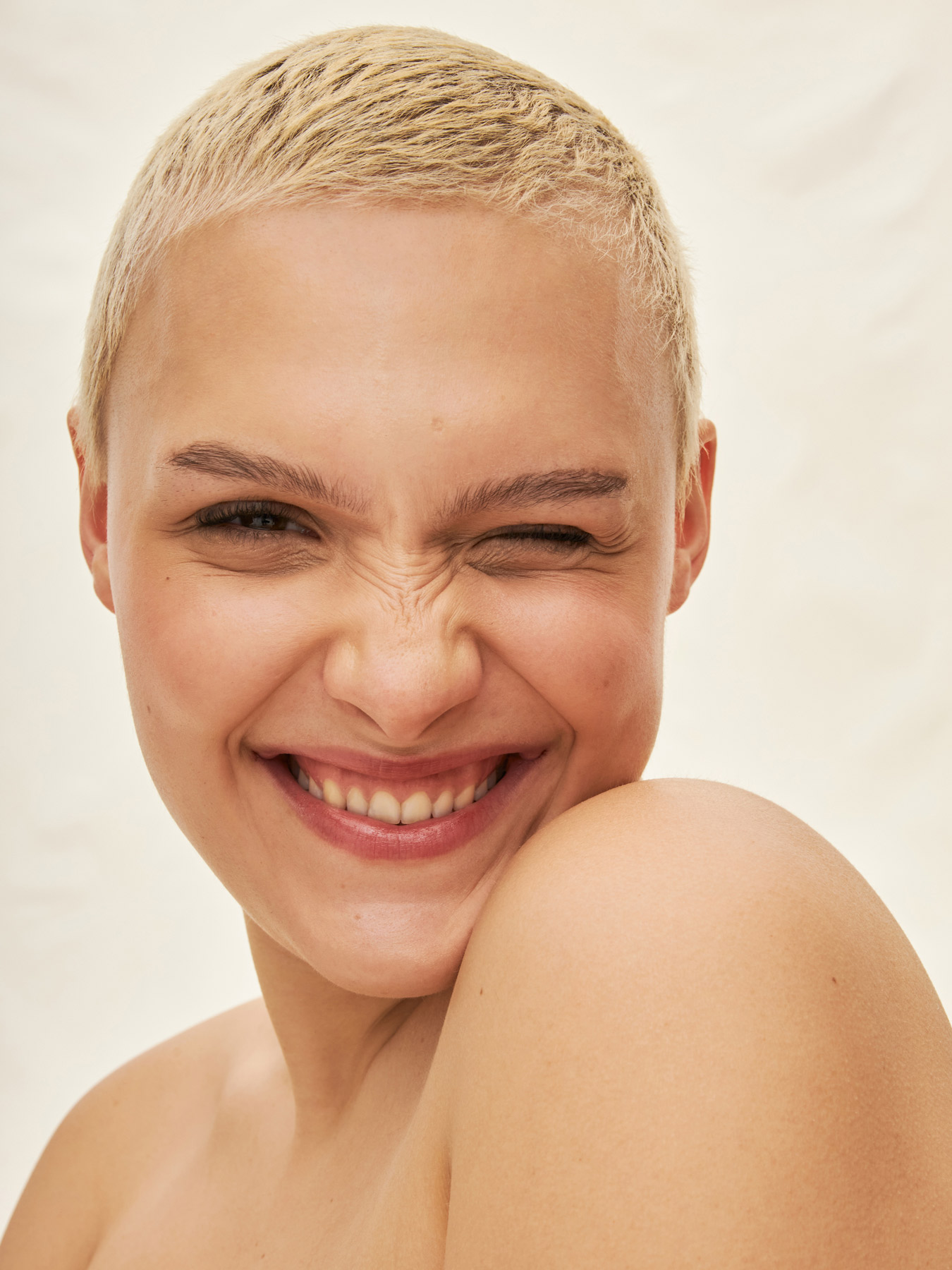


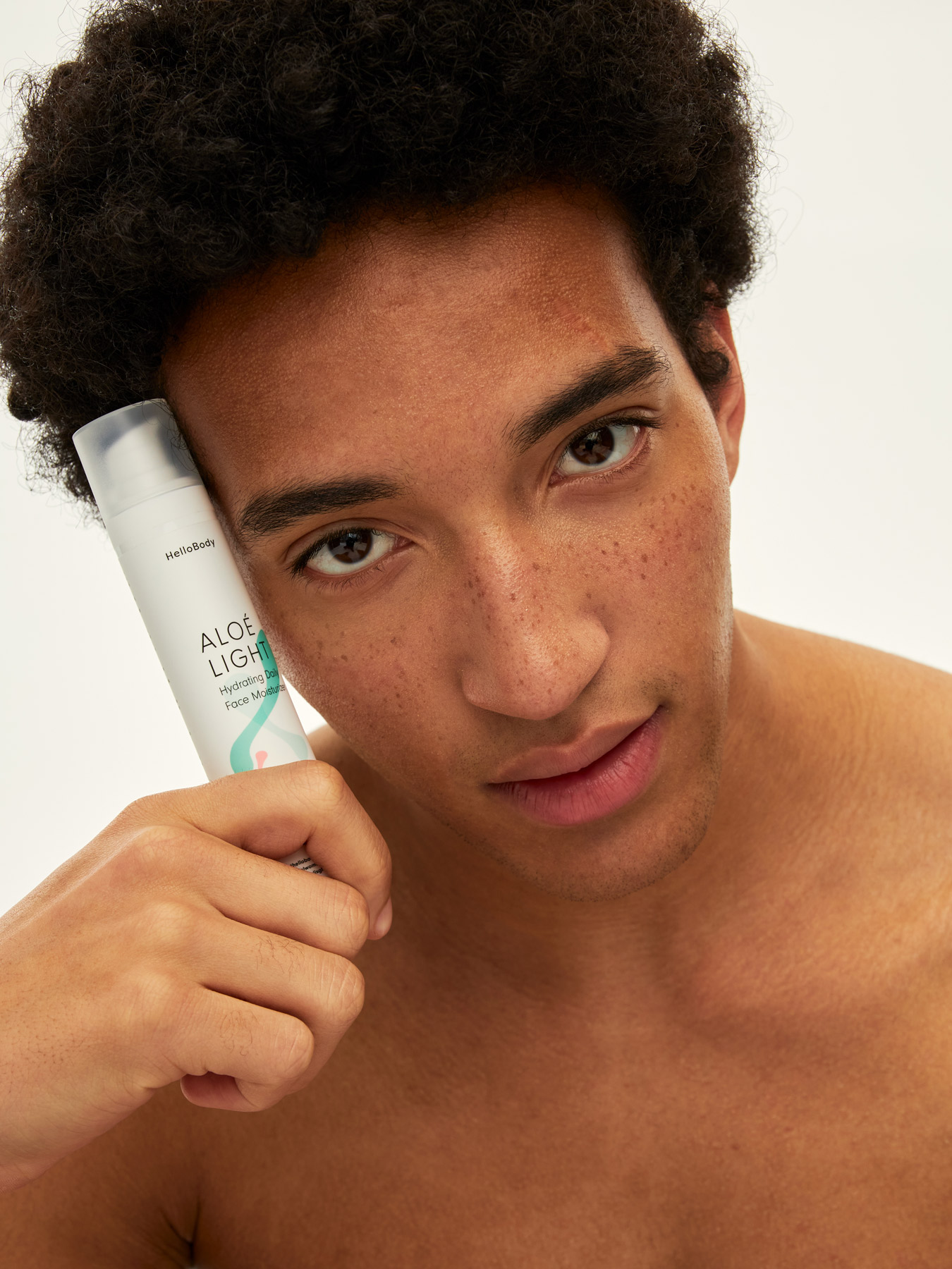
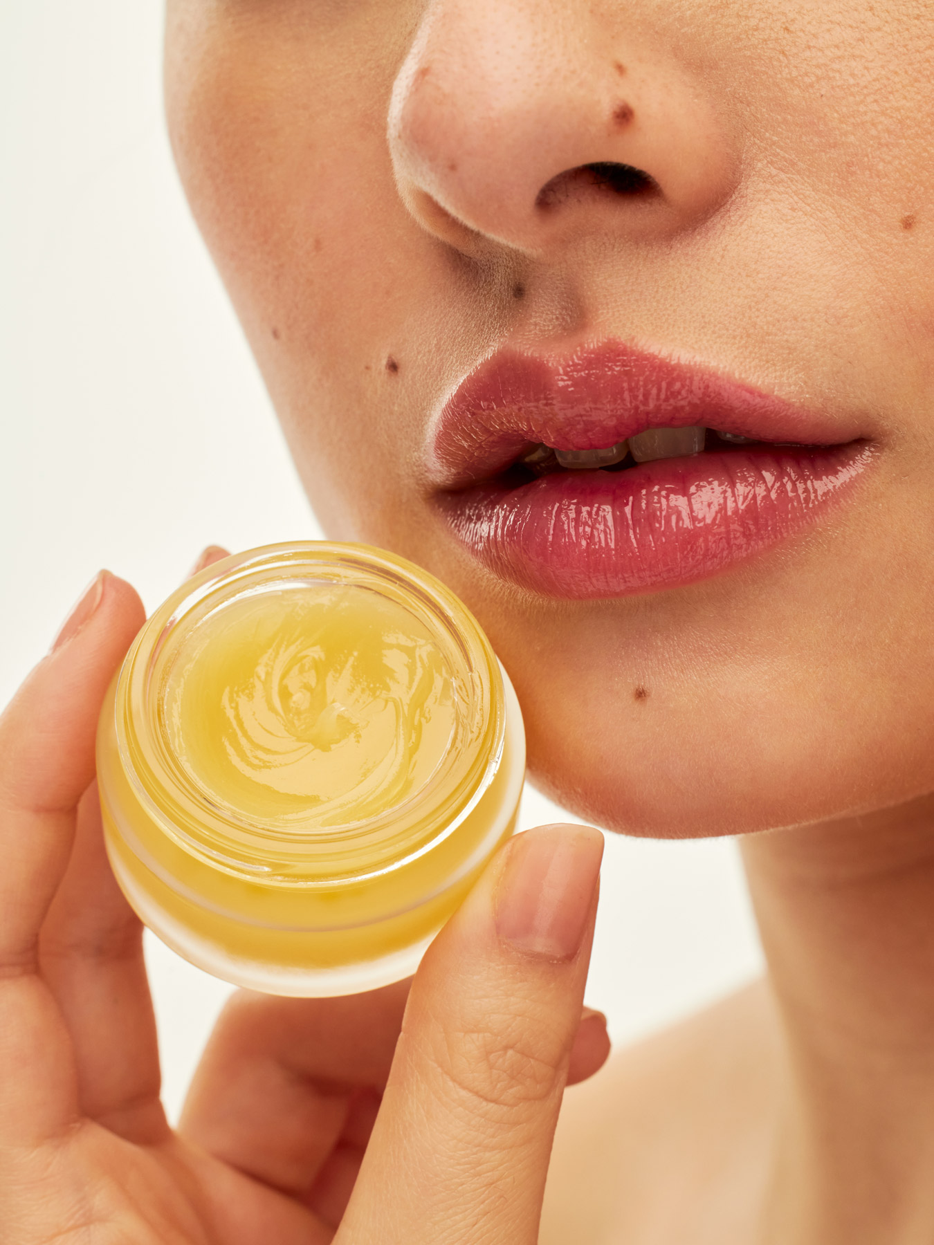
MODELS PHOTOGRAPHY: Now HelloBody is a more mature and aware, but still open and fun brand. The brand values are also: natural, social, welcoming, and caring. The main focus is on the skin with its all perfect imperfections.

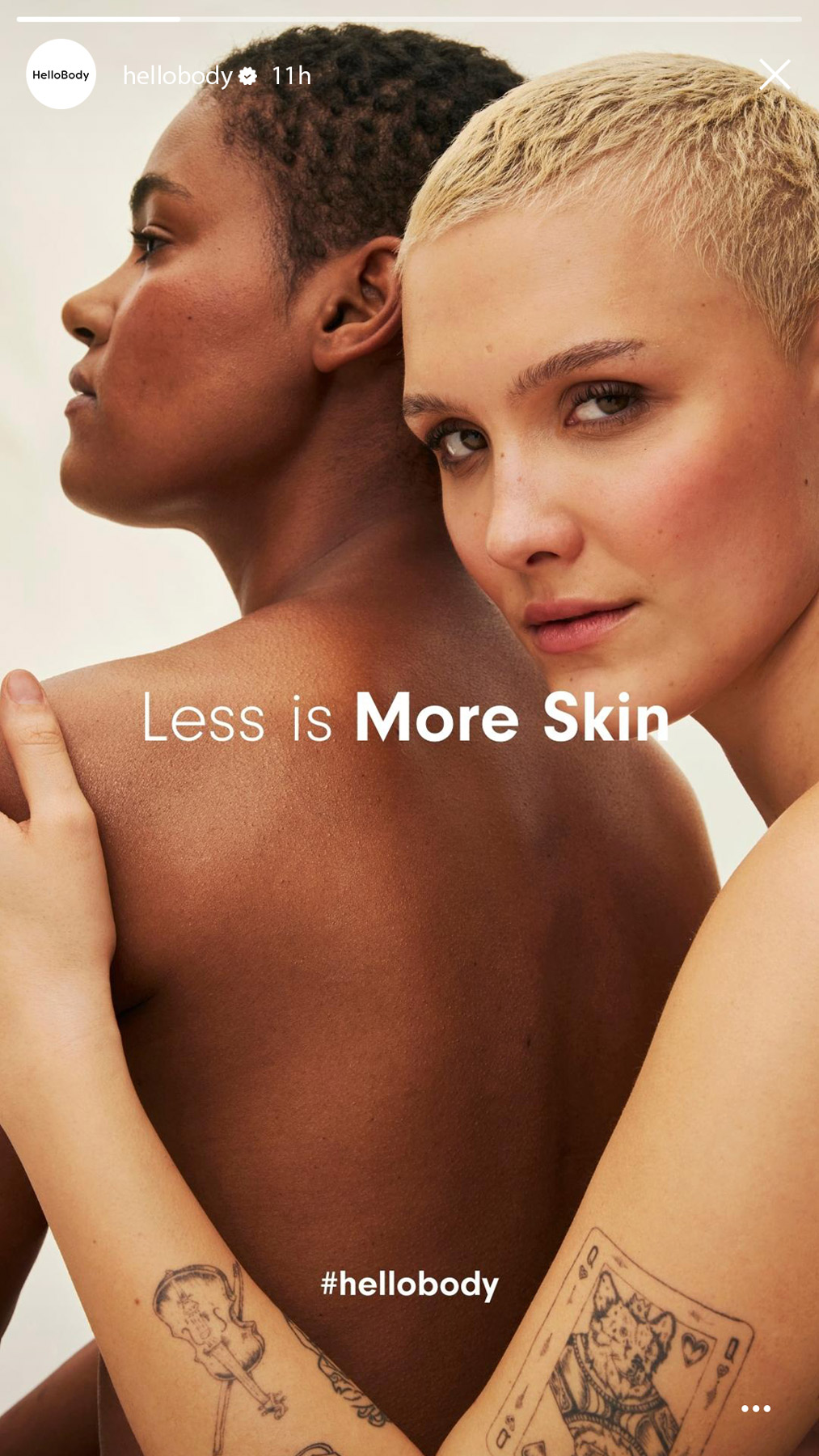
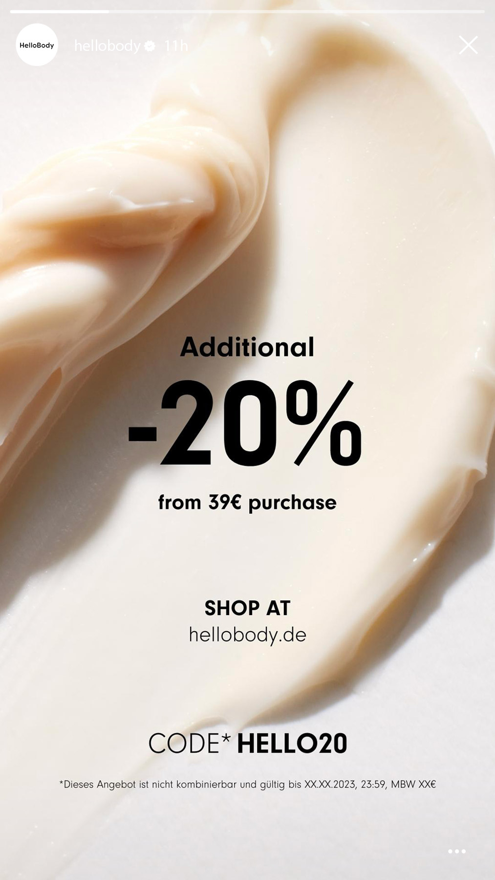
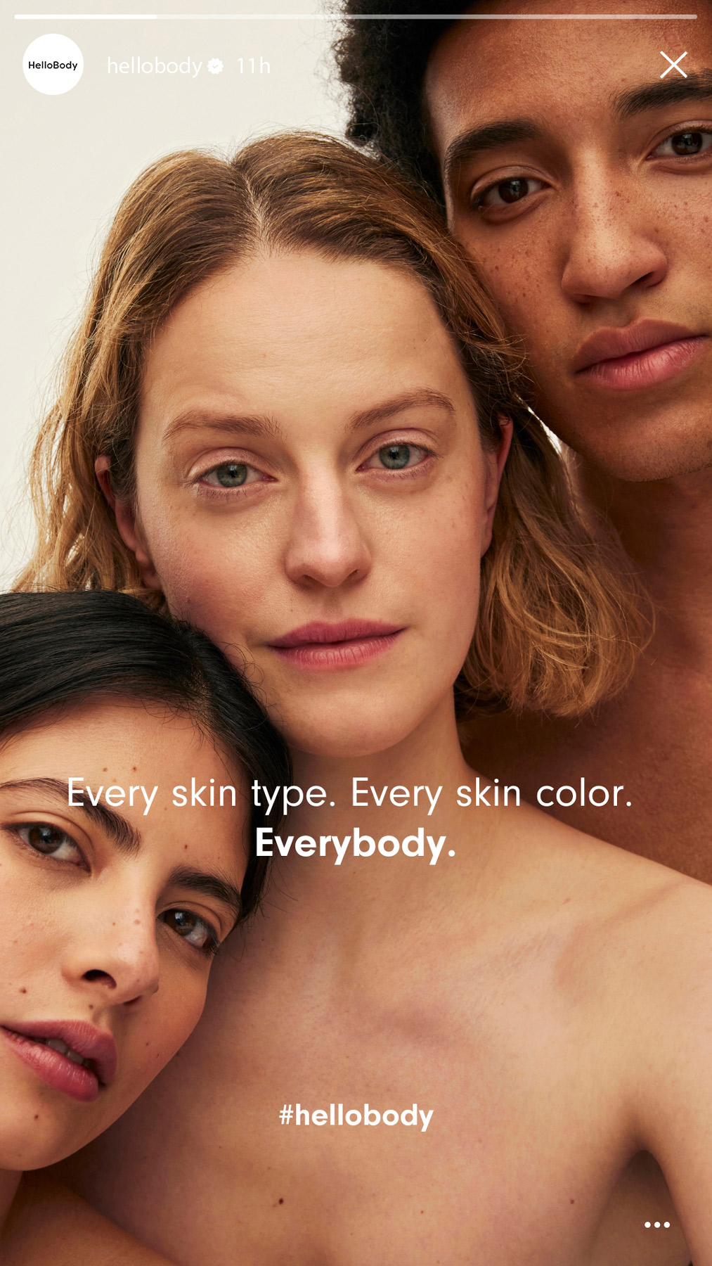

SOCIAL MEDIA: Instagram Story template.

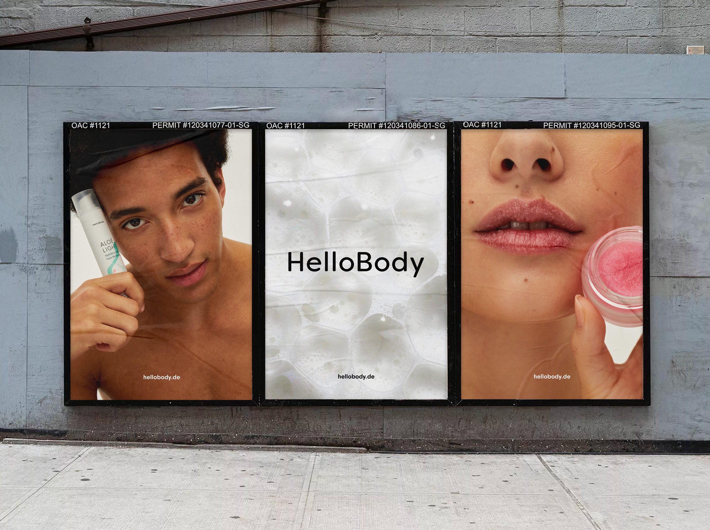
OOH LAYOUTS
Other works︎︎︎
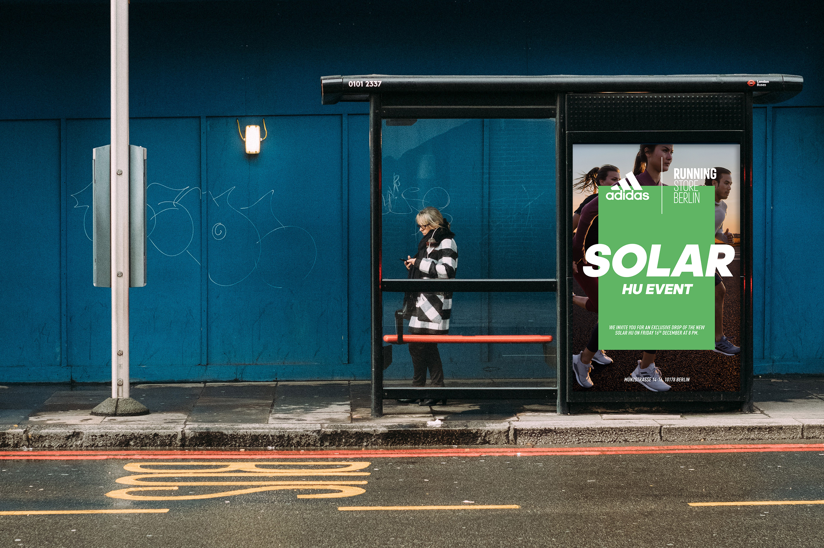
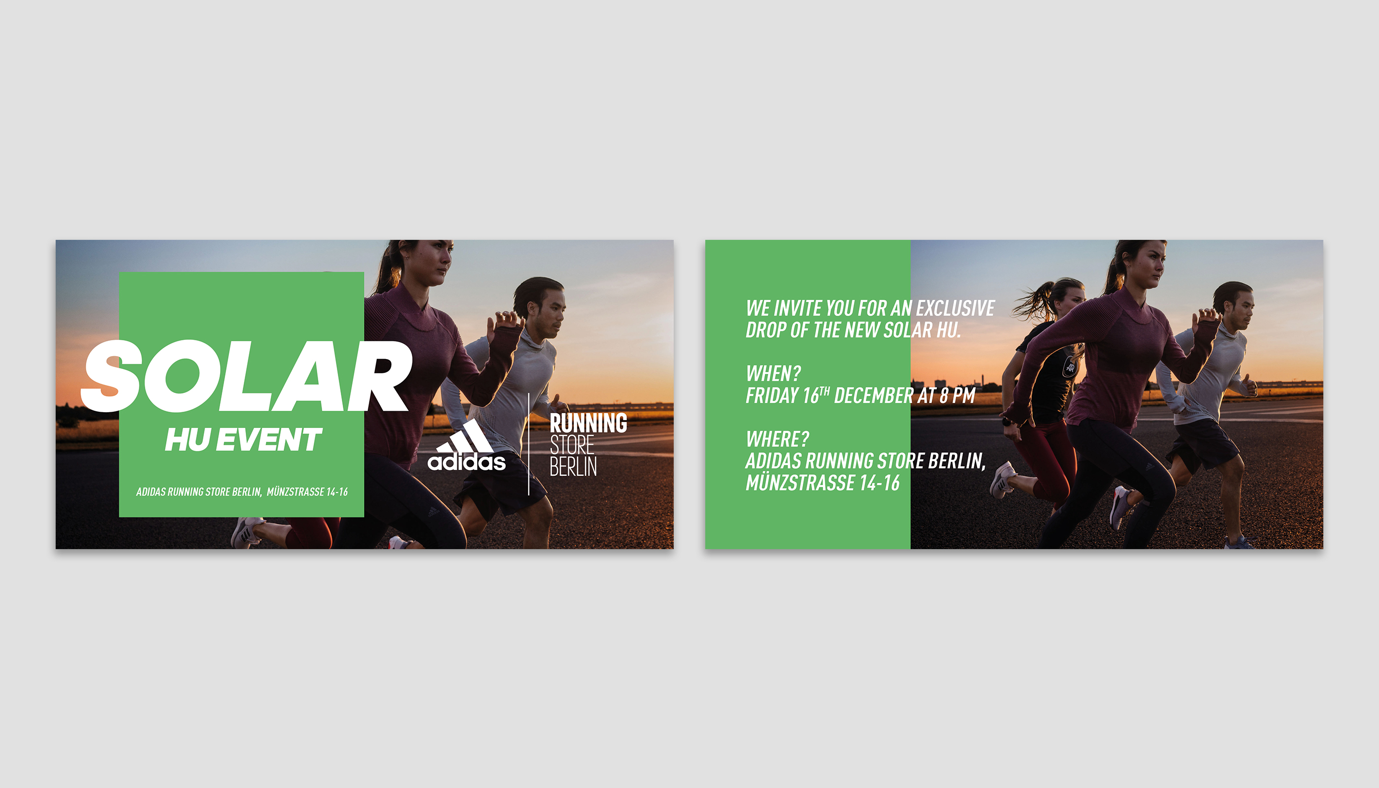
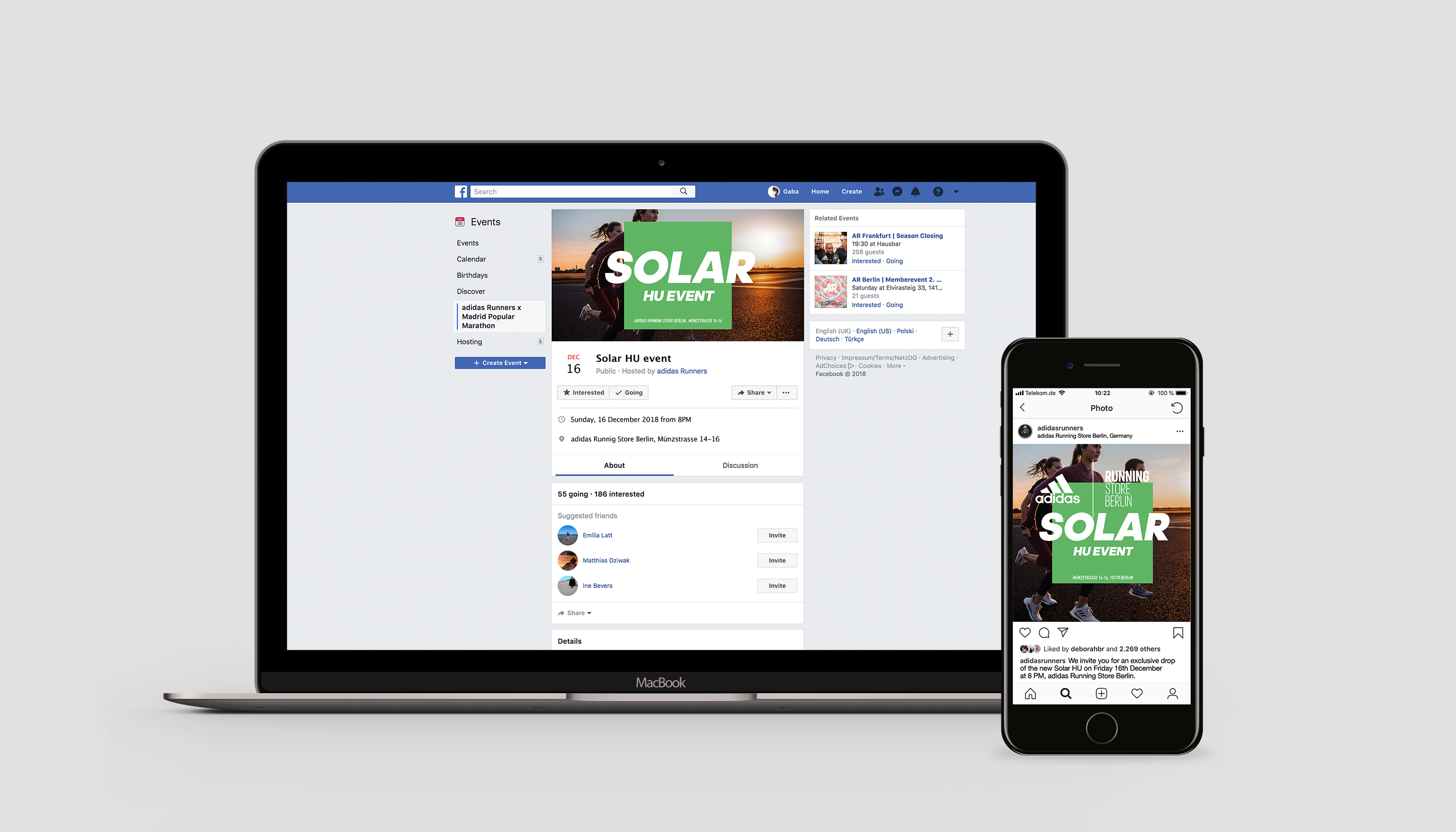
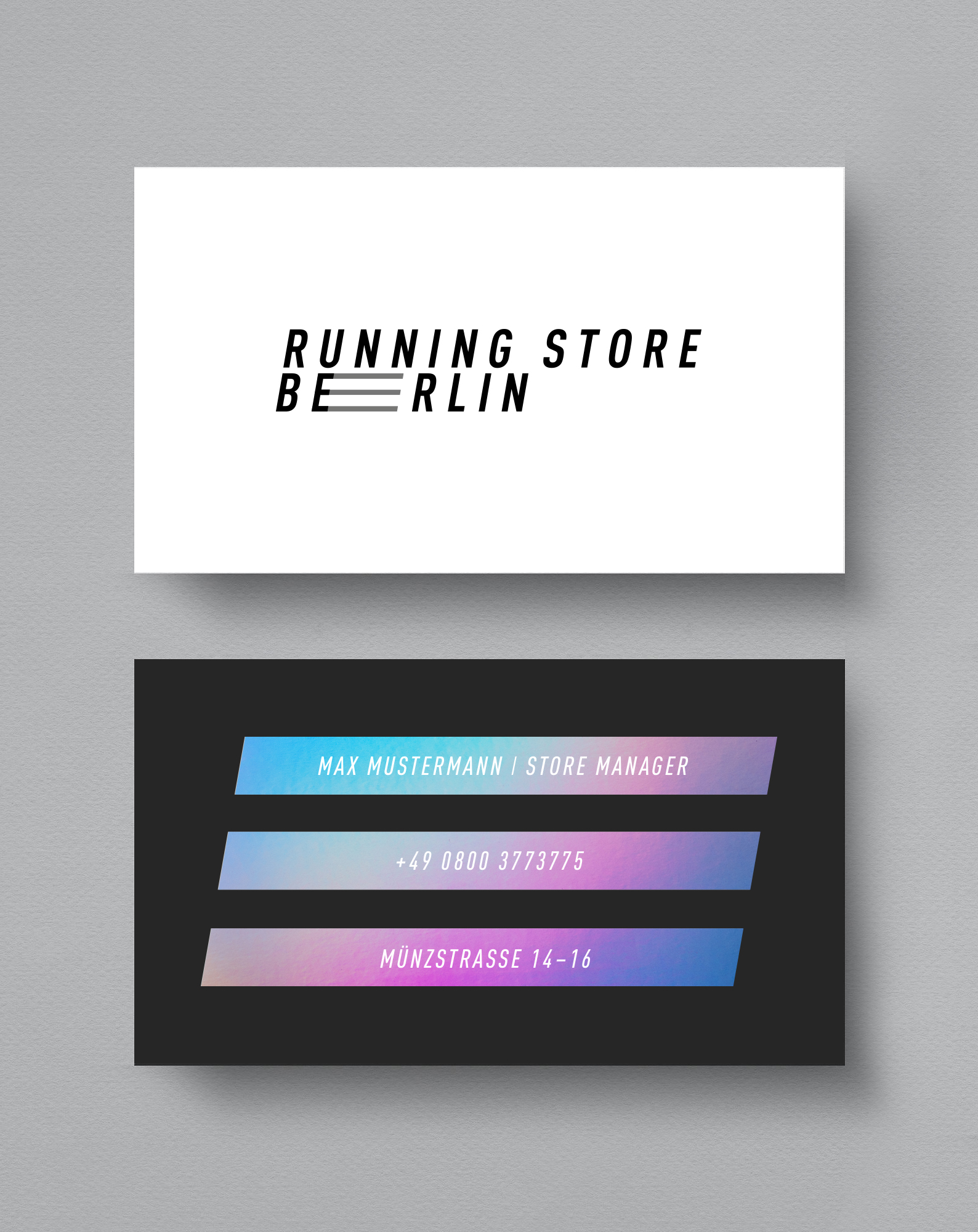
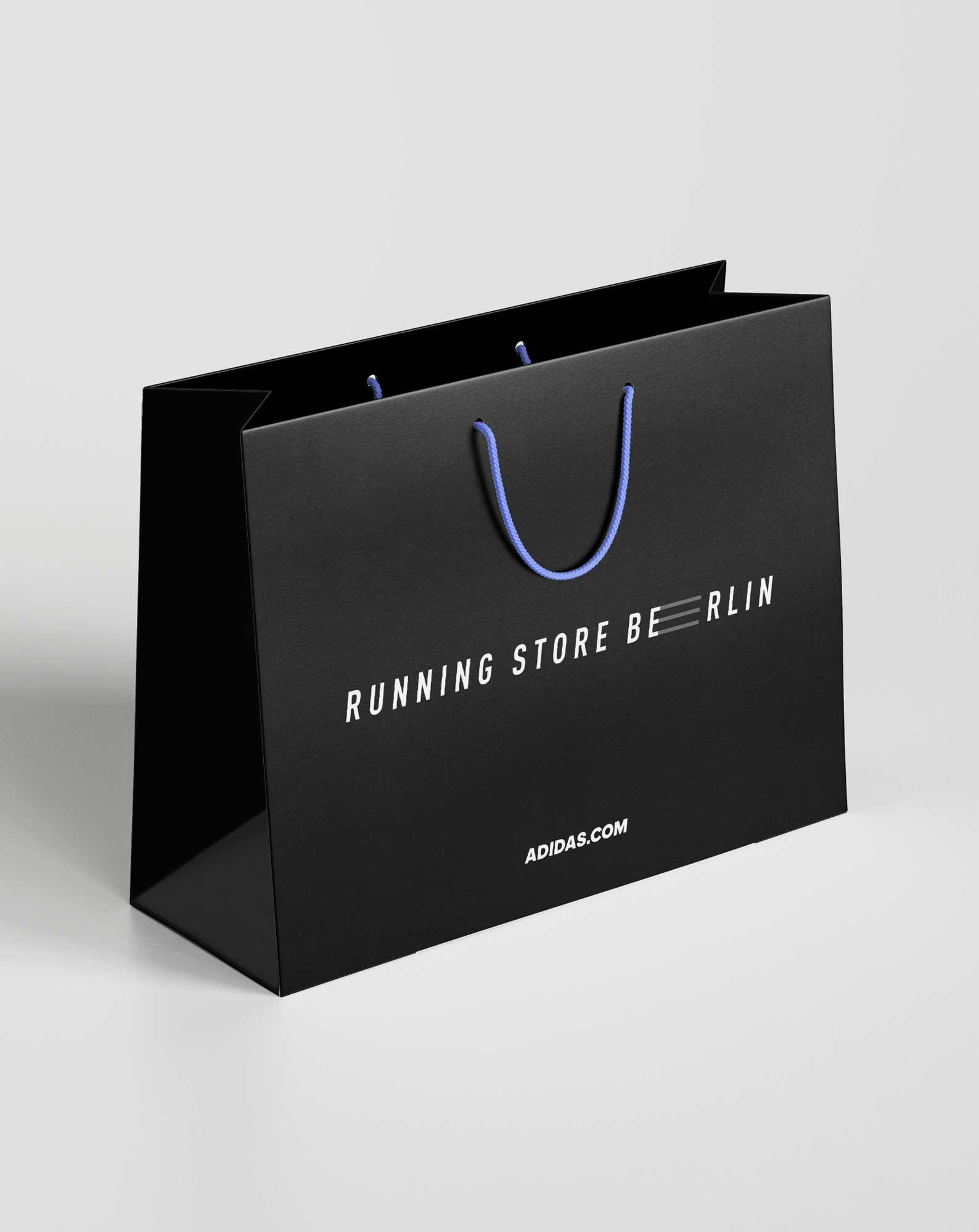
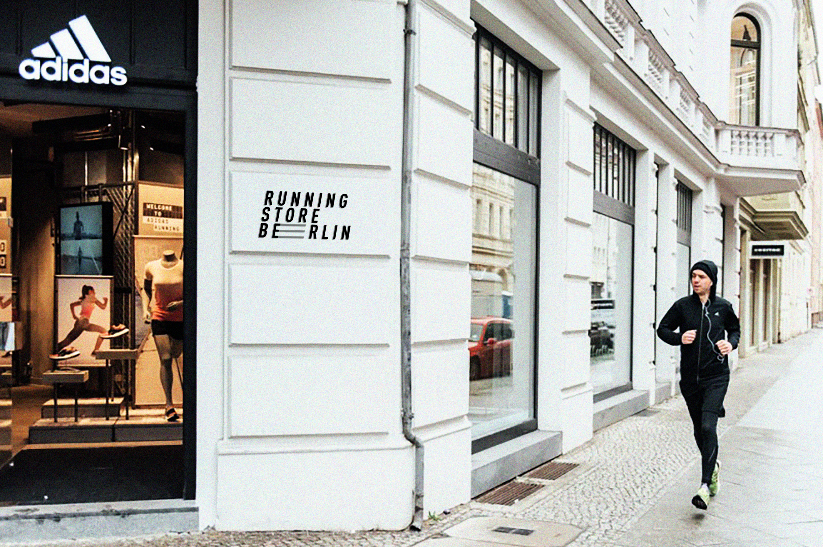
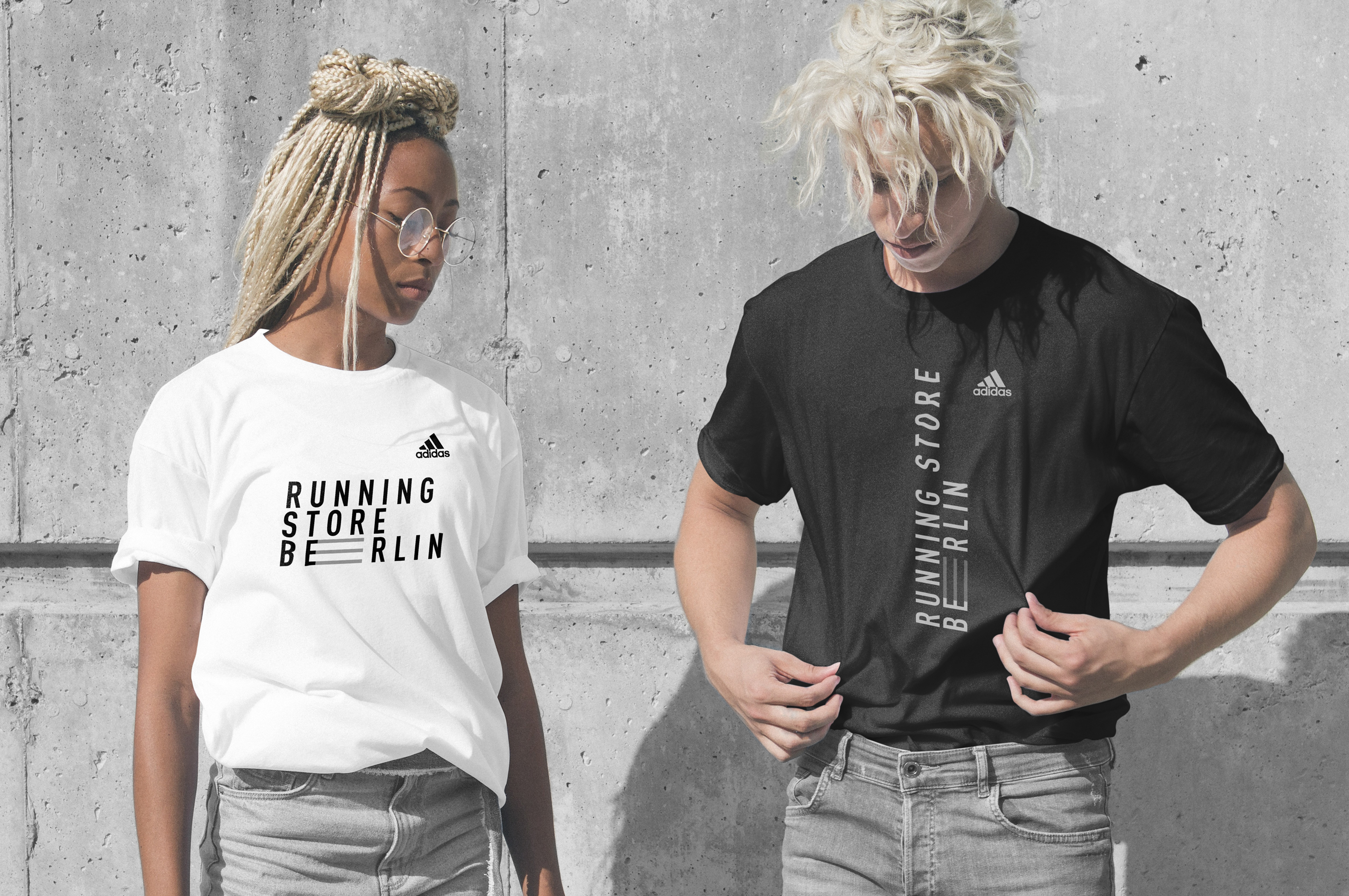
Running Store Berlin is an official adidas Running Store located in Mitte.
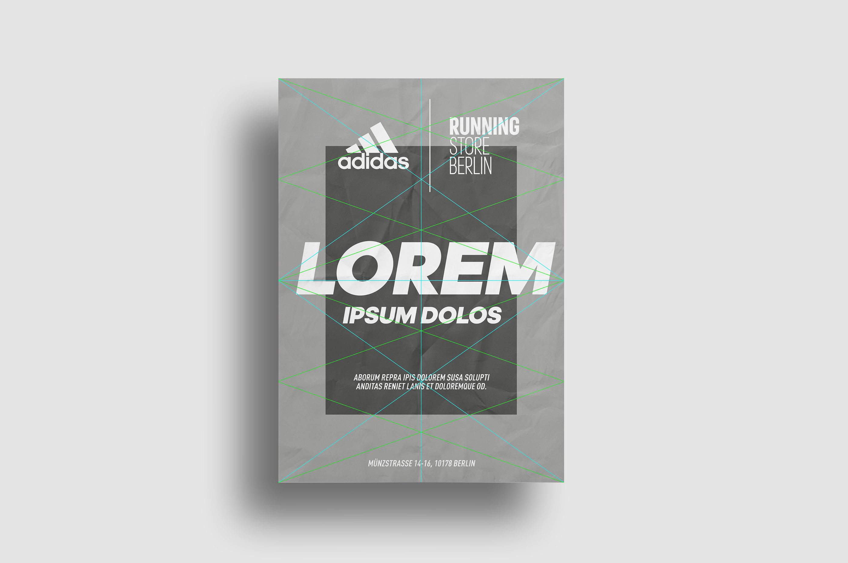
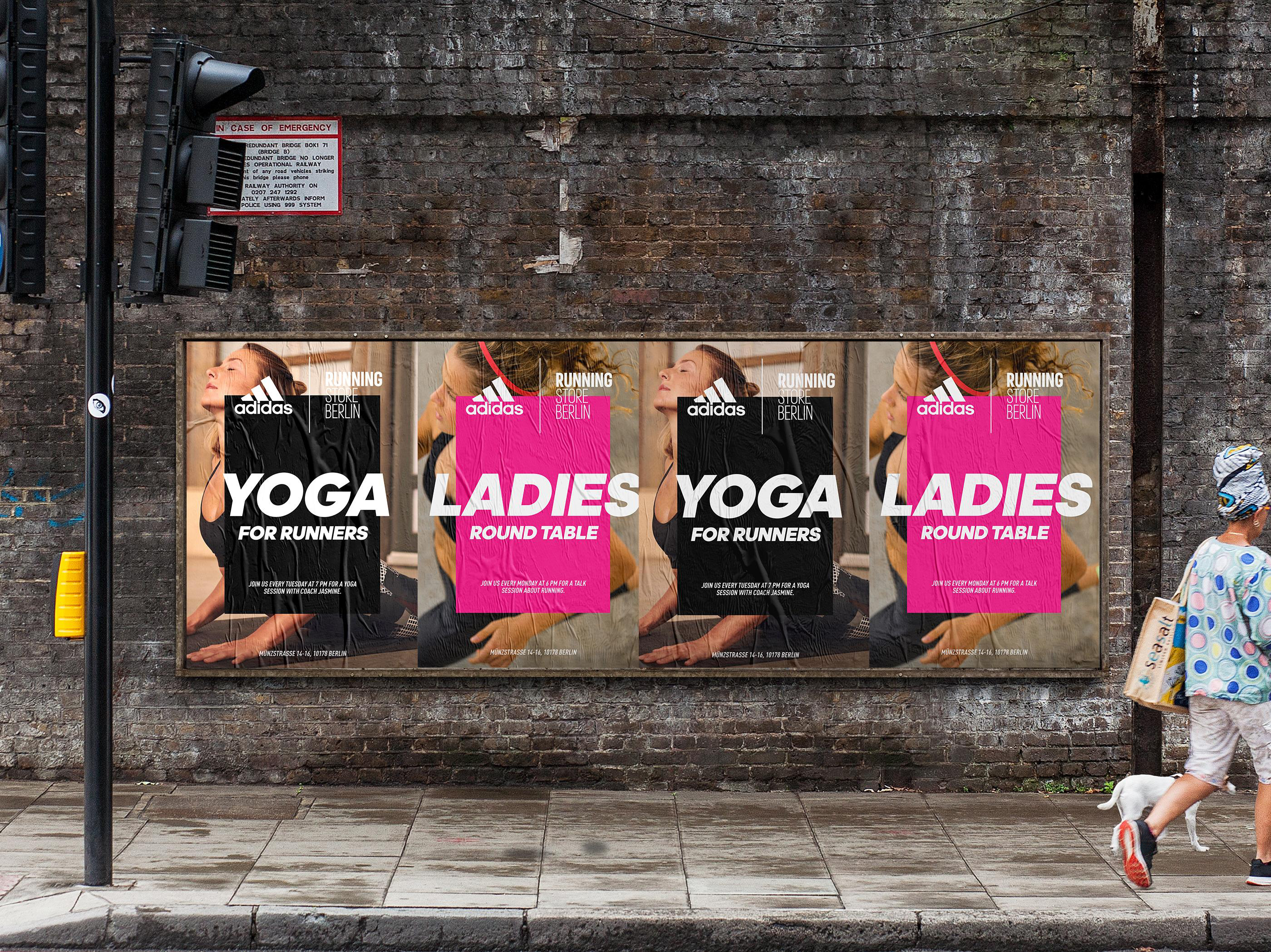
For this client, I designed an all-purpose template for posters, flyers, and Facebook/Instagram posts, that is in use for events that are organized by Running Store Berlin.
The layout is bold and quickly grabs attention. The colored graphic element makes it unique and attracts interest to the event.
Agency
Heimat active
Client
adidas
Heimat active
Client
adidas
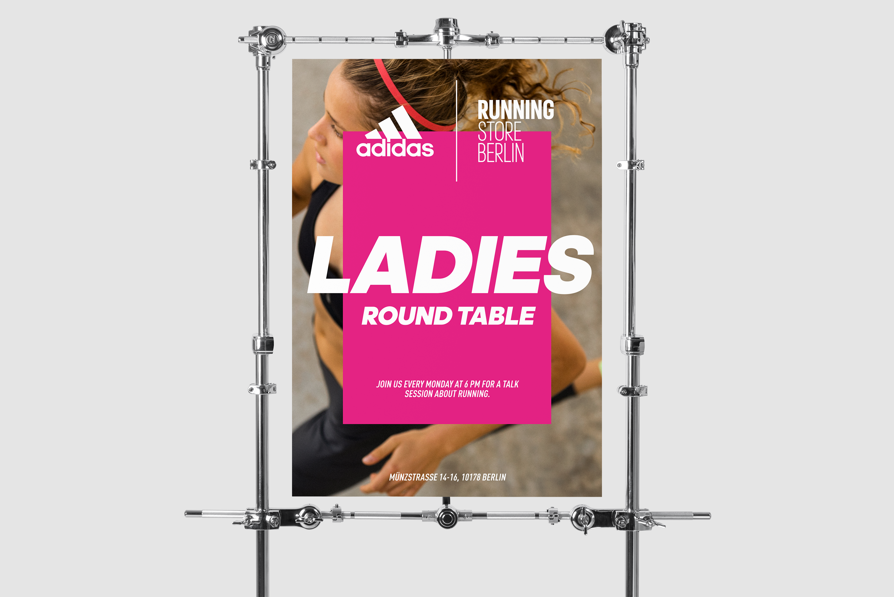
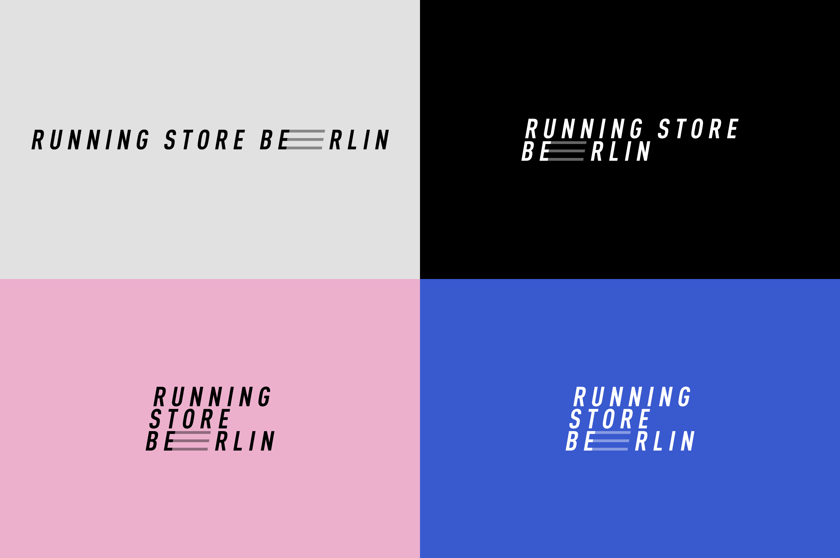
For this project I also did new logo concept for adidas Running Store in Berlin

Other works︎︎︎
Design and art direction for limited edition packaging design, 2021.
Agency
Invincible Brands
Client
HelloBody
Invincible Brands
Client
HelloBody
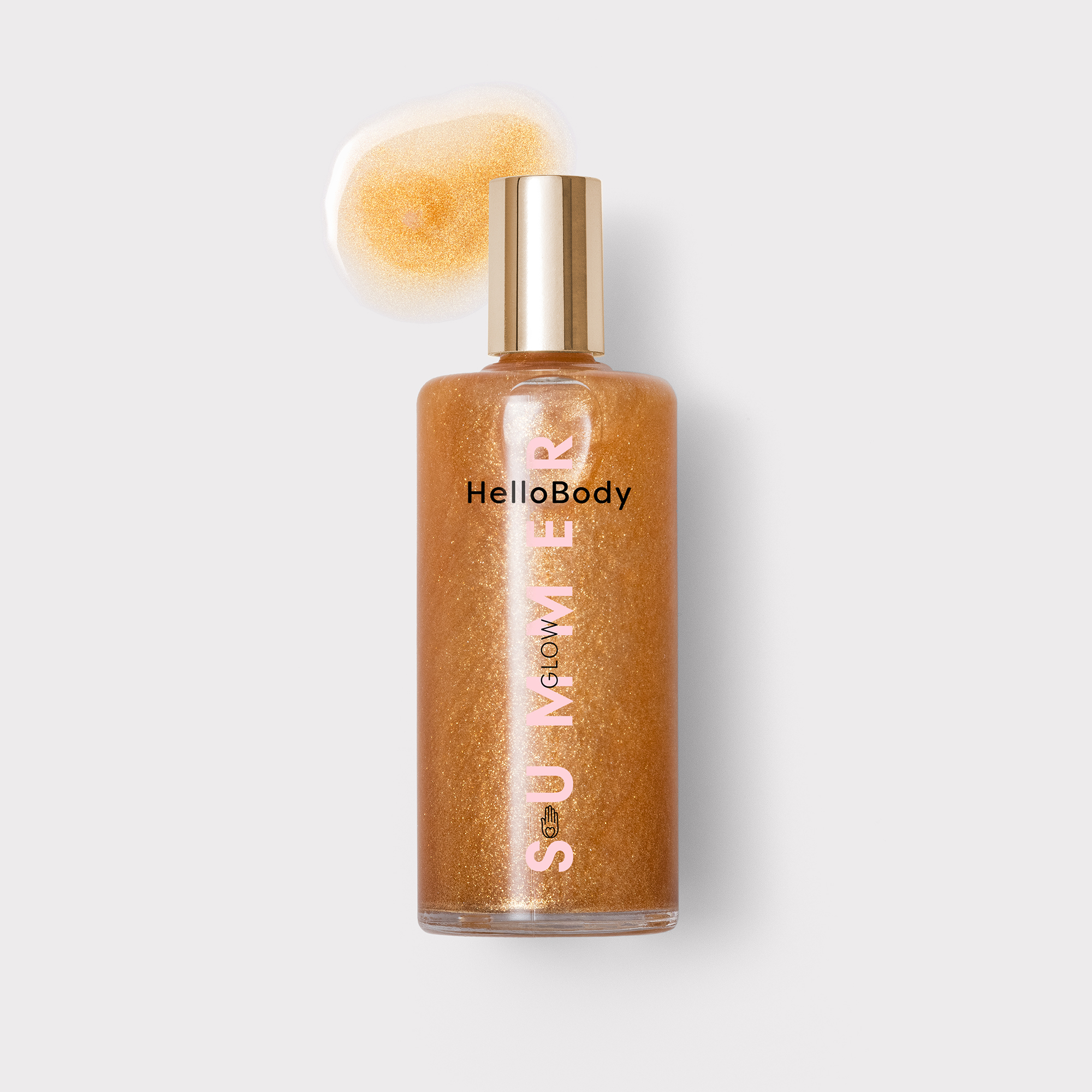

HelloBody Summer Shimmer Oil. The layout is based on modern, bold, and vertically placed typography. Our main hero is the word Summer, which stands for the freshness and playfulness of the season. Subtle, summery colors refer to two main ingredients of the product: Marula (yellow) and Pomegranate Oil (pink). The packaging is elegant, yet very graphic and playful.
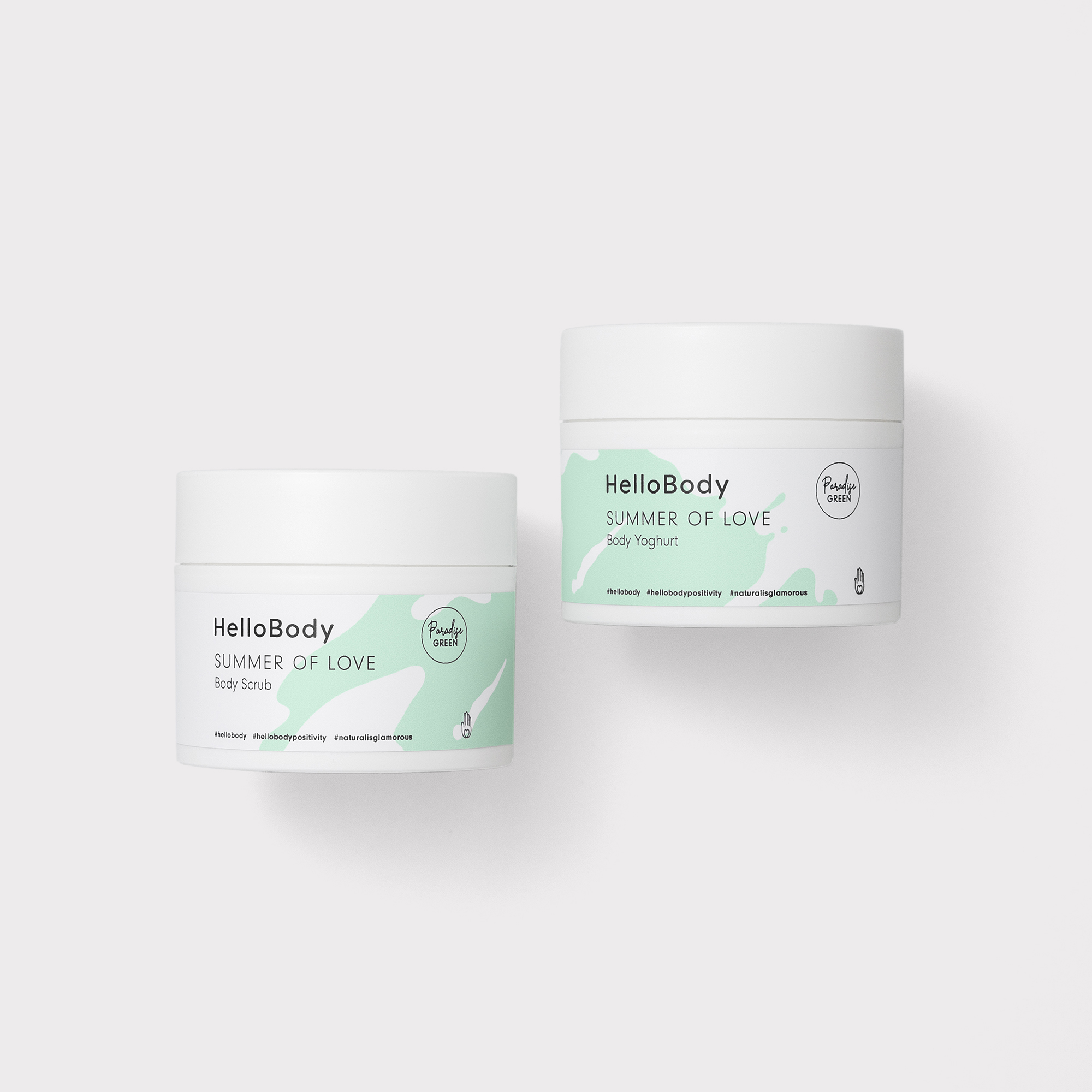
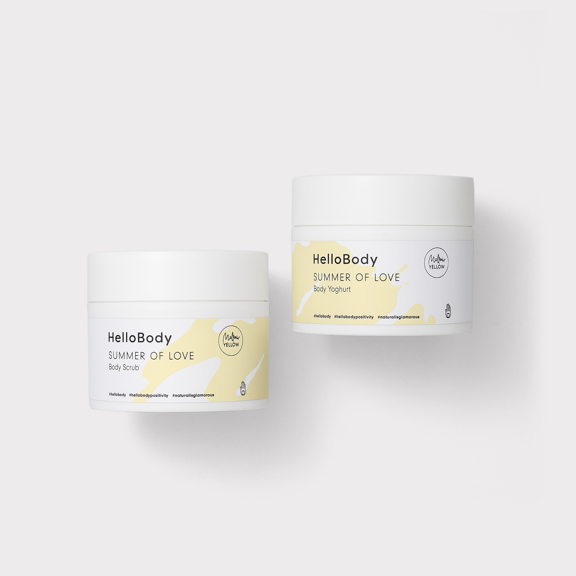


HelloBody Summer of Love, Global Limited Edition of body scrub and yoghurt. The visual concept for these packaging is inspired by the freedom and energy that summer gives to all of us. When both of the jars stand next to each other, the pattern creates one piece. The abstract, freehand painted shape relates to HelloBody visual world, as well as summerish elements such as water reflections, prints on the sand, summer structures like delicate ice cream, freshness and the power, that we take from these long sunny months.
Other works︎︎︎